
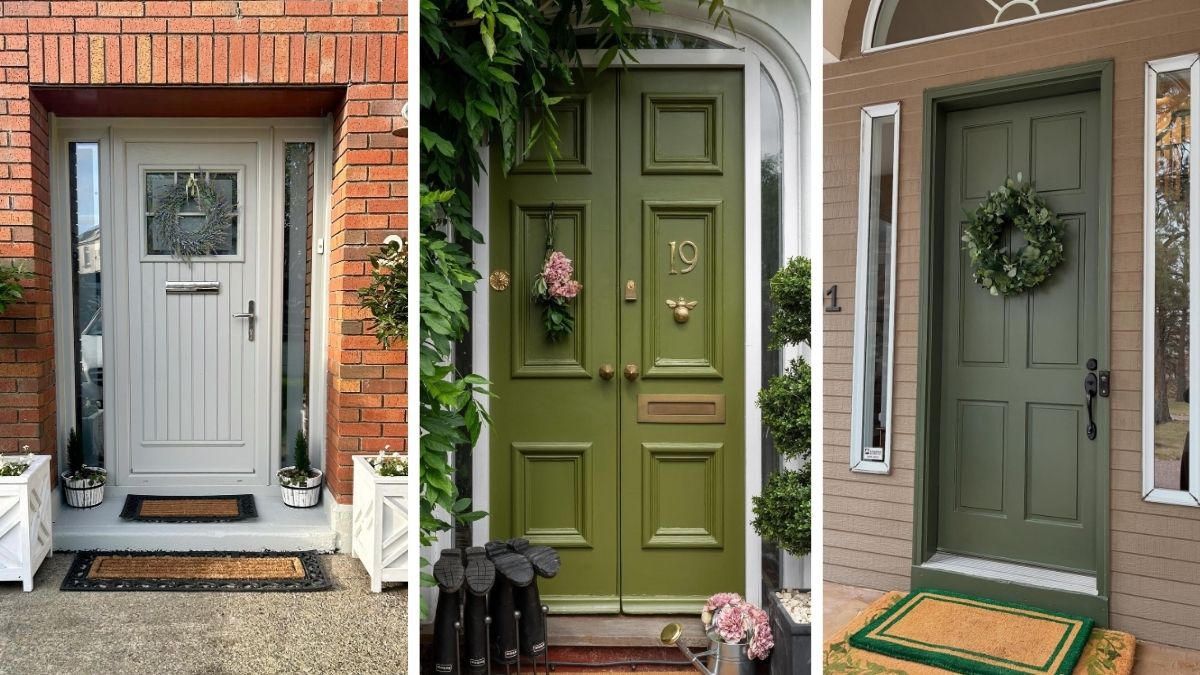
A faded or mismatched front door can make the whole house feel tired before guests even step inside. The wrong shade may fight the brick, flatten the siding, or disappear behind the landscaping.
That small color choice shapes the first impression of your home. When it feels off, even fresh paint, trimmed hedges, and new hardware struggle to make the exterior look intentional.
These front door colors show how rich neutrals, crisp classics, and bold accents can sharpen curb appeal fast. You will also learn which shades work best with brick, stone, siding, and trim.
Paint for First Impressions: Front Door Colors That Wake Up the Exterior
Start by reading the fixed colors around the entry. Brick, roof shingles, stone, trim, and porch flooring should guide the door shade instead of competing with it.
Use paint to create contrast, but keep the undertones connected. A warm red brick exterior often suits earthy greens, deep blues, and soft blacks better than icy shades.
- Color Anchor: Pull one undertone from the brick, stone, roof, or siding to create a connected exterior palette.
- Contrast: Choose a door shade that stands apart from the surrounding wall without looking unrelated.
- Finish: Use satin or semi gloss paint so the color reflects light and handles frequent cleaning.
- Statement Piece: Let the door carry the bold color while keeping trim, hardware, and porch decor restrained.
1. Deep Navy Front Door with Brass Hardware and Crisp White Trim
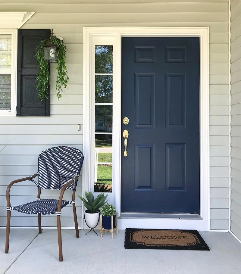
A deep navy front door stands out against soft gray lap siding, creating a sharp focal point without overpowering the porch. Bright white trim frames the entry, while polished brass hardware adds warmth. A woven black and white chair, small potted plants, and a simple lantern with trailing greenery keep the space clean and welcoming.
Deep navy feels bold because the surrounding palette stays light and restrained.
Keep the supporting pieces quiet when using a rich door color like this. Matching dark shutters, natural wood accents, and touches of fresh greenery help the entry feel balanced instead of heavy, while metallic hardware gives the darker paint extra depth in daylight.
2. Deep Aubergine Front Door with Matching Sidelights and Twin Lanterns
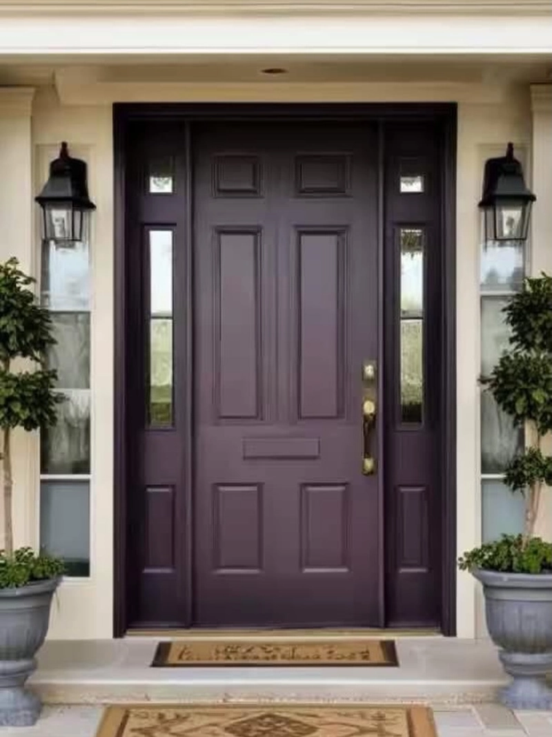
Rich aubergine door fills the wide entry, with matching painted sidelights creating one strong block of color. Cream trim keeps the dark purple grounded, while brass hardware, black lanterns, and paired topiary planters bring warm symmetry to the porch.
Painting the sidelights to match makes the entrance feel wider, richer, and more architectural.
This shade works because it reads almost black in shadow, then reveals plum and brown undertones as the light shifts. Pair a complex door color with pale masonry, restrained greenery, and balanced fixtures so the finish remains the clear focal point.
3. Oxblood Red Front Door with Brass Handle and Matching Geraniums
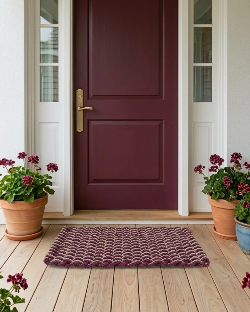
Deep oxblood red door brings warmth to the crisp white entry, while narrow glass sidelights keep the porch bright. Aged brass hardware adds a soft golden note, and terracotta pots filled with burgundy geraniums echo the door color across the wood decking.
Repeating the door shade in small accents makes a bold color feel grounded and intentional.
This palette works because the red carries brown undertones that sit easily beside natural wood and clay pots. Keep the trim clean and pale, then repeat the main shade through flowers, textiles, or planters rather than adding several competing colors.
Why This Works
- Color Echo: Burgundy blooms and the woven doormat repeat the door shade without matching it exactly.
- Warm Materials: Brass, terracotta, and wood soften the depth of the dark red paint.
- Balanced Framing: Matching planters on both sides guide the eye toward the center of the entrance.
4. Muted Olive Front Door Beneath a Steep White Gabled Canopy
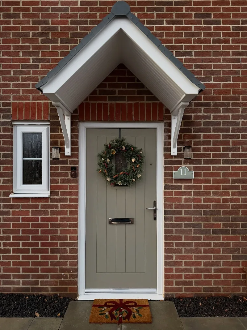
Muted olive door softens the red brick facade and sits neatly beneath a crisp white pitched canopy. Slim silver hardware keeps the entry practical, while the evergreen wreath and gift motif doormat add seasonal warmth without covering the door color.
Earthy green bridges the gap between strong red brick and sharp white trim.
Choose a green with gray or brown undertones when the brick already carries several warm shades. This quieter tone calms the busy masonry, while the white frame and canopy keep the entrance clear, bright, and well defined.
5. Powder Blue Craftsman Door with Cedar Shingles and White Sidelights
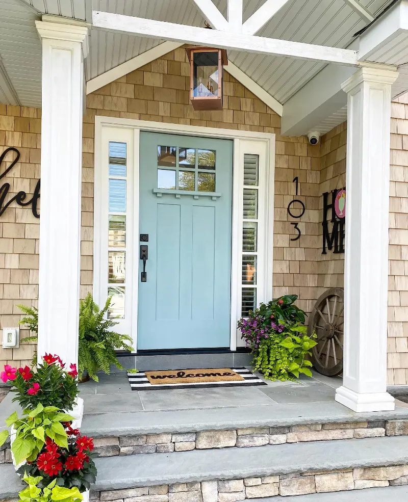
A powder blue door brings a breezy note to the warm cedar shingles and gray stone steps. White sidelights, chunky porch posts, and exposed roof beams frame the entry, while layered plants and a striped mat add texture around the pale color.
Soft blue works best when warm wood and crisp white trim keep it from feeling washed out.
This shade suits a covered porch because filtered light brings out its calm blue green undertone. Black hardware adds needed contrast, while the loose mix of ferns, flowering pots, and trailing leaves helps the structured entry feel more lived in.
Quick Decorating Tips
- Budget version: Paint an existing door and repeat the color with one small planter or outdoor cushion.
- Renter tip: Use a pale blue door cover or removable exterior film where building rules allow it.
- Pro move: Add matte black hardware to sharpen the soft color and connect it to darker exterior details.
6. Sage Gray Front Door with Dark Glass Sidelights and Aged Brass Details
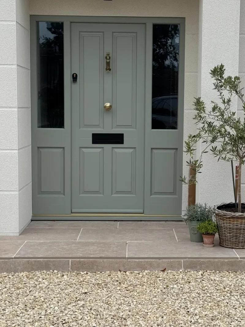
Sage gray door and matching sidelights create one calm block of color against the pale rendered walls. Dark glass panels add depth, while aged brass hardware, a black letter slot, and a woven planter filled with an olive tree bring contrast and texture.
A muted green gray gives a broad entrance presence without making it feel heavy.
This shade works because it connects with the silvery leaves, taupe paving, and warm gravel underfoot. Keep nearby planters in related earthy tones, then use dark accents sparingly so the soft door color remains clear and balanced.
7. Butter Yellow Craftsman Door with Gridded Glass and White Sidelights
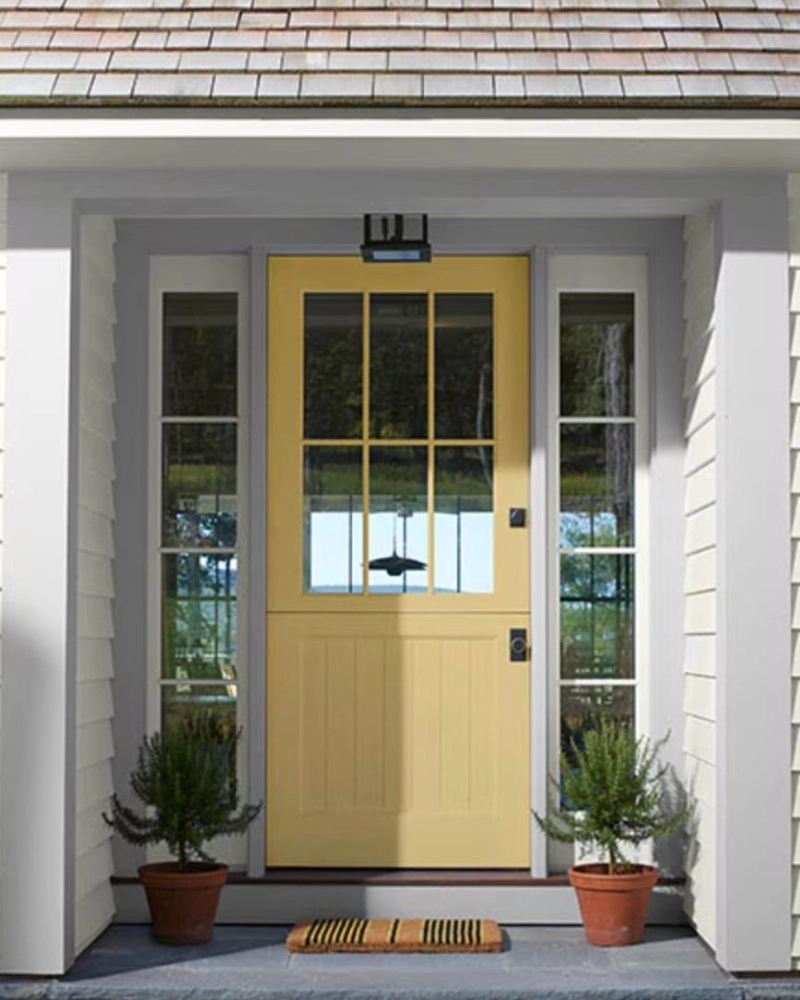
Butter yellow door brings a sunny lift to the crisp white siding and deep gray porch floor. Gridded glass fills the upper half, while matching sidelights, black hardware, and two small terracotta planters keep the entry balanced and easy to read.
Soft yellow adds warmth without overpowering a restrained exterior palette.
This shade works because its muted tone feels gentler than a bright primary yellow. Pair it with white trim, dark metal accents, and natural clay pots so the color feels fresh rather than sugary.
8. Dusty Rose Front Door with Aged Brass Hardware and Climbing Roses
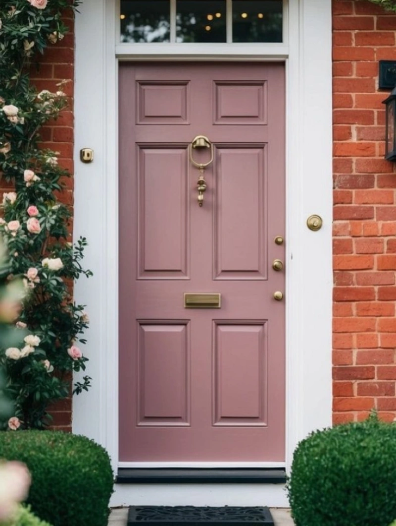
A dusty rose door softens the warm red brick while crisp white trim keeps the entrance defined. Aged brass hardware adds a mellow glow, and pale climbing roses repeat the pink tones beside two clipped green shrubs.
Muted pink works with brick when its undertones feel earthy rather than sugary.
Choose a rose shade with brown, gray, or clay notes so it relates to the masonry around it. Green foliage gives the warm palette needed contrast, while repeated brass details make the soft door color feel more grounded.
9. Pale Sage Front Door with Fanlight and Polished Brass Hardware
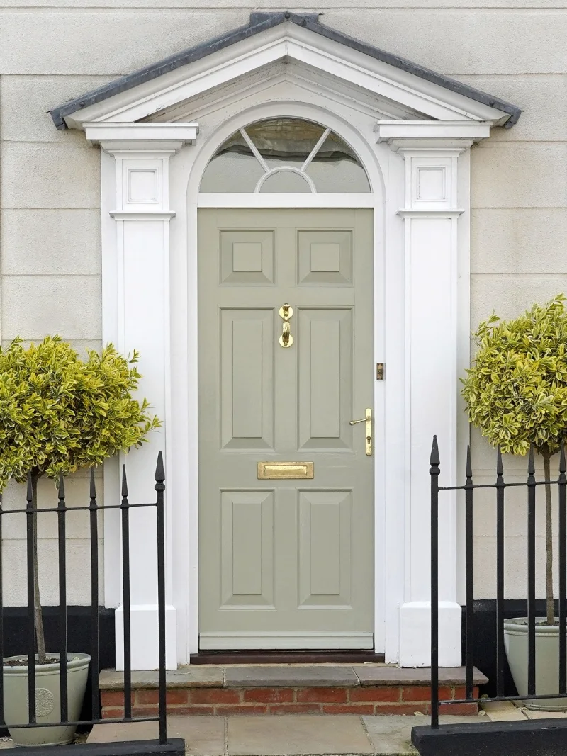
Pale sage door sits beneath a graceful fanlight and crisp white classical trim. Polished brass hardware warms the muted paint, while clipped variegated trees and black iron railings create strong contrast around the narrow entry.
A quiet green lets ornate architecture lead while still giving the doorway a clear point of color.
The shade works because its soft gray undertone relates to the rendered facade and stone step. Black railings sharpen the pale palette, while the brass knocker, handle, and letter slot add enough warmth to keep the entrance from feeling flat.
Why This Works
- Architectural Frame: White columns and the arched fanlight give the muted door a strong, formal outline.
- Metal Contrast: Polished brass adds warmth while black iron brings crisp definition.
- Natural Link: Variegated foliage repeats the door’s green tone in a softer, more organic way.
10. Cornflower Blue Front Door with Stained Glass Panels and Brass Hardware
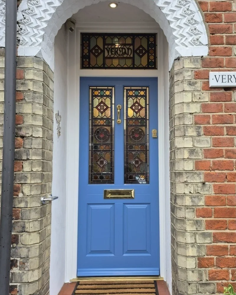
Cornflower blue door brightens the sheltered brick entry while two tall stained glass panels add amber, burgundy, and green detail. White trim frames the color cleanly, and polished brass hardware picks up the warmer tones in the patterned glass.
A clear blue door gives ornate stained glass room to stand out without making the entry feel busy.
Use one solid paint color when the glazing already carries several shades and shapes. The blue creates a calm backdrop, while the brick arch, white plasterwork, and brass accents keep the entrance layered and grounded.
Quick Decorating Tips
- Budget version: Paint the door blue and add removable stained glass film to plain glass panels.
- Renter tip: Repeat the look with a blue door cover and peelable patterned window film.
- Pro move: Match the hardware finish to the warmest tones inside the decorative glass.
11. Classic Crimson Front Door with Black Siding and White Hydrangeas
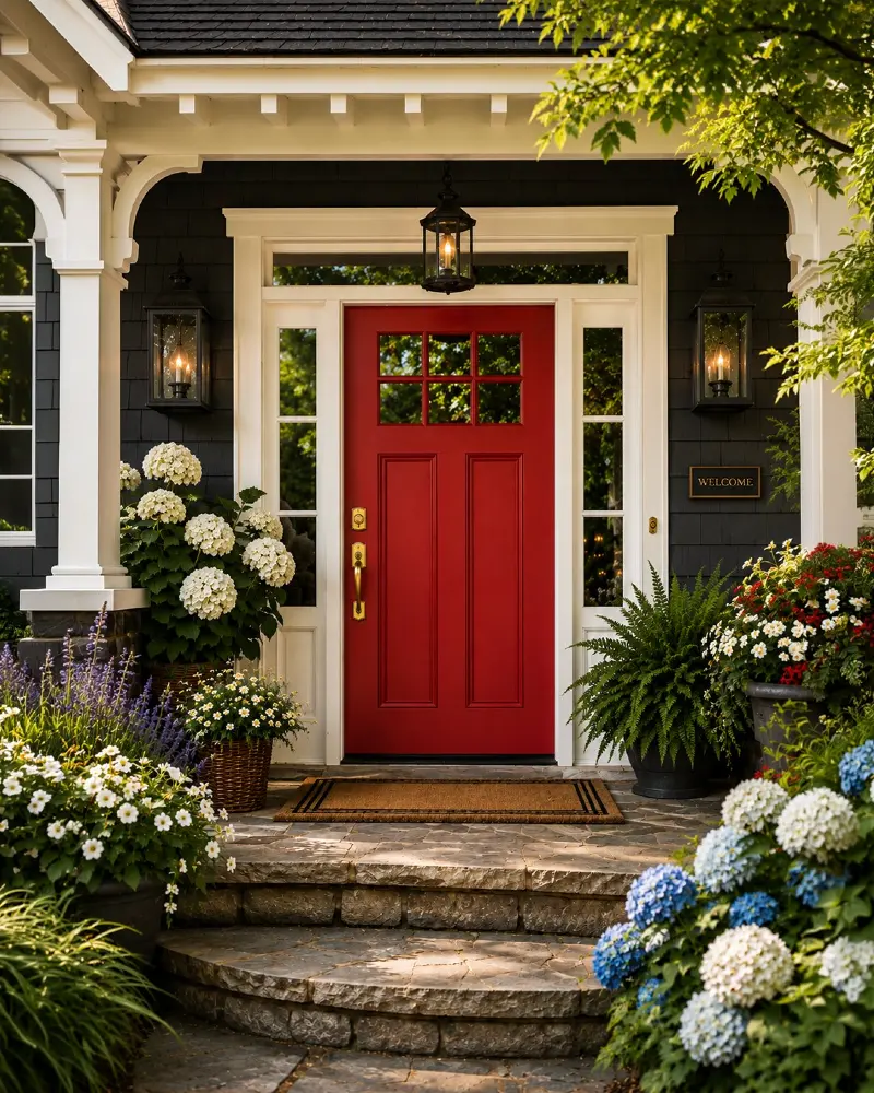
Classic crimson front door becomes the clear focal point against charcoal siding and crisp white trim. Large black lanterns, polished brass hardware, layered stone steps, and overflowing hydrangeas create a rich entry that feels balanced rather than busy.
A true red door gains even more impact when the rest of the exterior stays restrained.
This color succeeds because the dark siding lets the red stand forward, while white trim keeps the entrance bright and well defined. Repeat the warm tones with brass hardware, then soften the strong contrast using lush greenery and flowering containers instead of adding more bold colors.
12. Forest Green Front Door with Eucalyptus Wreath and Black Hardware
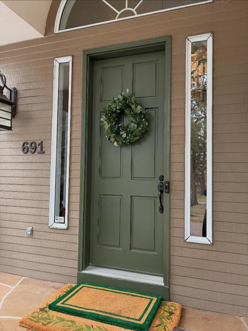
Deep forest green door blends smoothly with the taupe siding while narrow mirrored sidelights add height and shine. Black hardware gives the muted palette a crisp edge, and a dense eucalyptus wreath repeats the door’s earthy tone with softer texture.
Dark green feels grounded when nearby finishes stay warm, quiet, and low contrast.
The color works because it carries gray undertones that connect with the siding instead of fighting it. Layered coir mats bring warmth at floor level, while the black lantern and house numbers give the entry enough definition to avoid looking flat.
13. Warm Greige Front Door with Black Hardware and Cottage Canopy
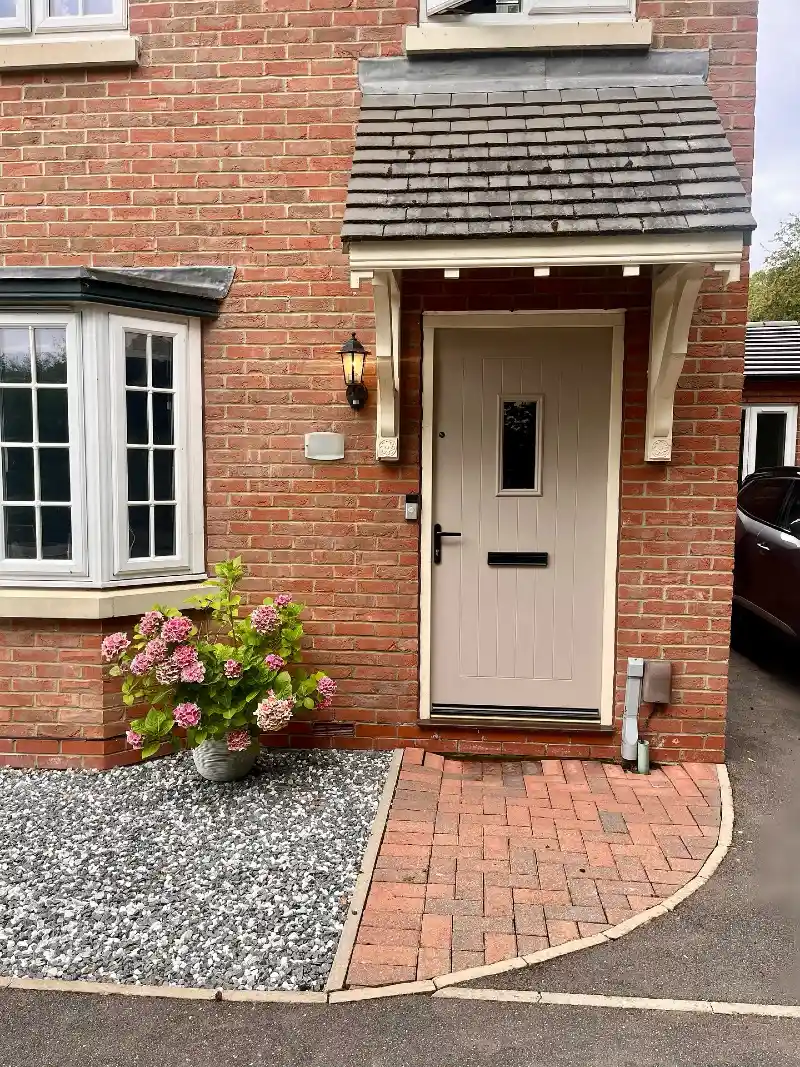
Warm greige door softens the orange red brick and sits neatly beneath a cream timber canopy with a weathered slate roof. Vertical paneling adds quiet texture, while the narrow glass insert, black hardware, glowing lantern, and potted pink hydrangea give the compact entrance clear detail.
Greige calms strong brick without draining the front of the house of warmth.
This shade works because its beige undertone relates to the mortar, trim, and paving around the doorway. Black accents sharpen the pale paint, while one flowering planter adds color without competing with the brick facade.
14. Moss Green Double Doors with Brass Bee Knocker and Climbing Foliage
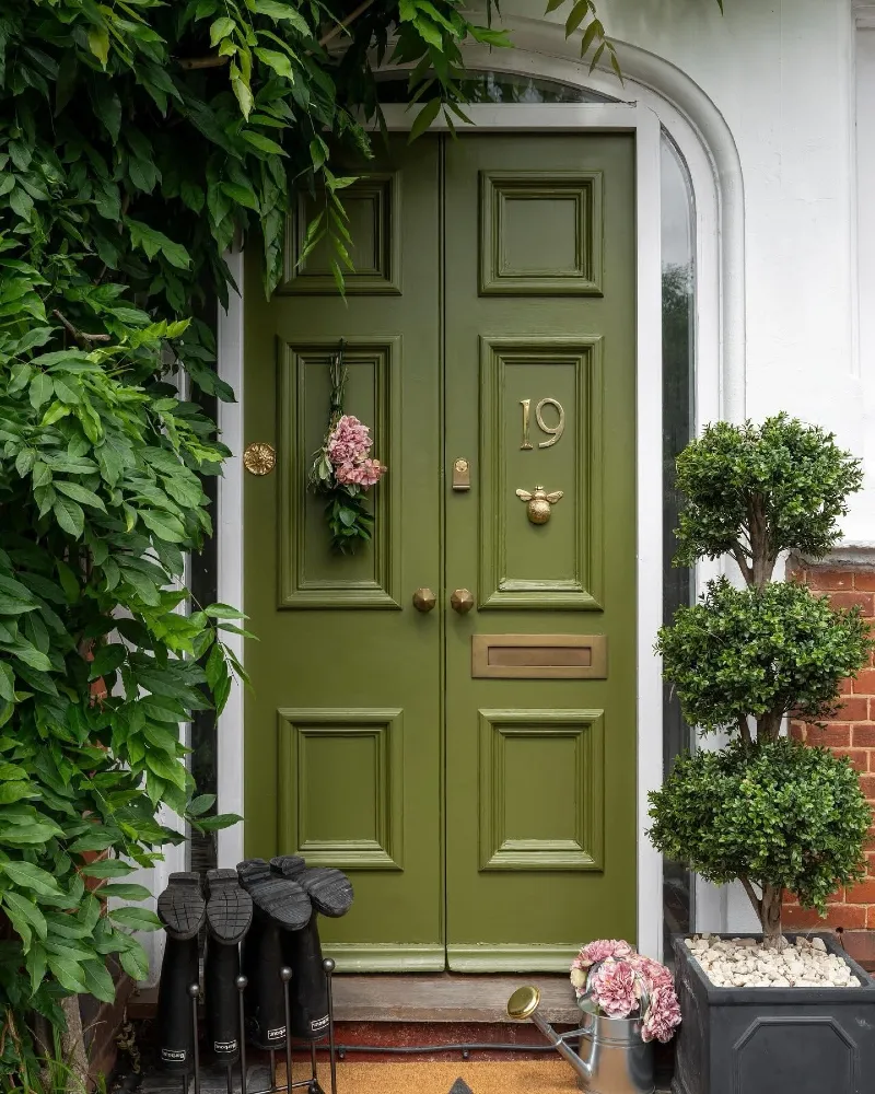
Moss green double doors sit beneath a curved fanlight and blend into the thick leafy growth framing the entrance. Brass numbers, knobs, a letter slot, and a bee knocker bring warm shine, while a clipped topiary and pale pink flowers soften the strong green palette.
Matching the door to nearby foliage makes the entrance feel rooted in the garden.
This shade works because its yellow undertone connects with living greenery and warm brick. Keep the trim white for a clean outline, then use aged brass details to stop the earthy color from feeling dull or overly rustic.
15. Mushroom Taupe Front Door with Brass Details and Boxwood Planters
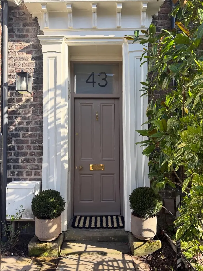
Mushroom taupe door sits inside crisp white architectural trim, creating a soft bridge between the dark weathered brick and pale entry frame. Warm brass hardware adds a gentle glow, while clipped boxwood planters and a striped mat bring symmetry and structure to the narrow approach.
A brown based neutral can soften old brick while still giving the doorway clear definition.
This shade works because it shares the masonry’s earthy undertones without blending into it. Strong white trim keeps the entrance bright, while the round greenery and golden hardware stop the muted door color from feeling flat.
Quick Decorating Tips
- Budget version: Refresh an existing door with a warm taupe paint and reuse plain planters in matching positions.
- Renter tip: Add removable brass effect numbers and a striped outdoor mat to bring in the same polished contrast.
- Pro move: Frame the door with matching clipped shrubs to make a slim entrance feel more balanced.
16. Vermilion Red Front Door with Leaded Glass Sidelights and Brass Hardware
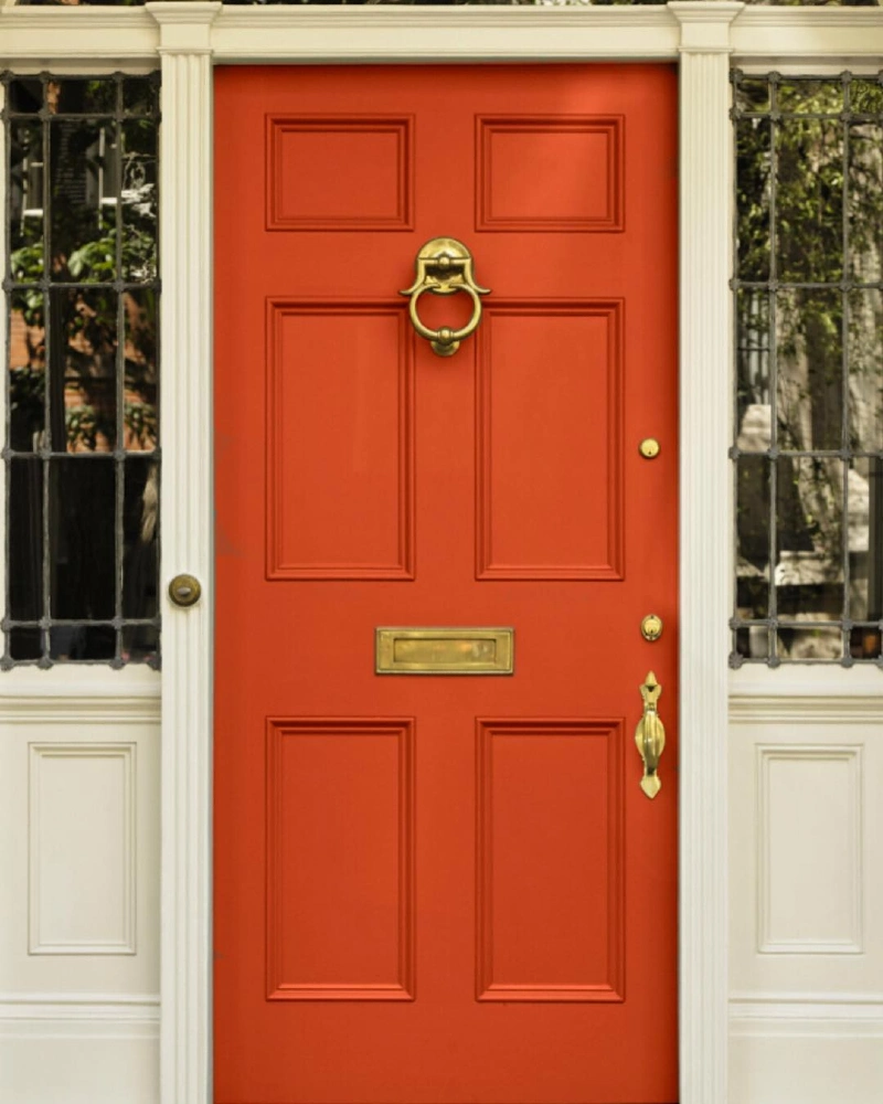
Vivid vermilion door fills the center of the entry, framed by creamy white trim and dark leaded glass sidelights. Warm brass hardware catches the light across the knocker, letter slot, lock, and handle, giving the strong red paint a more polished finish.
A fiery red door feels controlled when the frame around it stays pale, formal, and symmetrical.
This shade works because its orange undertone brings warmth without disappearing beside the dark glass. Keep nearby trim quiet and repeat one metal finish throughout so the color remains bold rather than chaotic.
17. Soft Putty Front Door with Slim Sidelights and White Planter Boxes
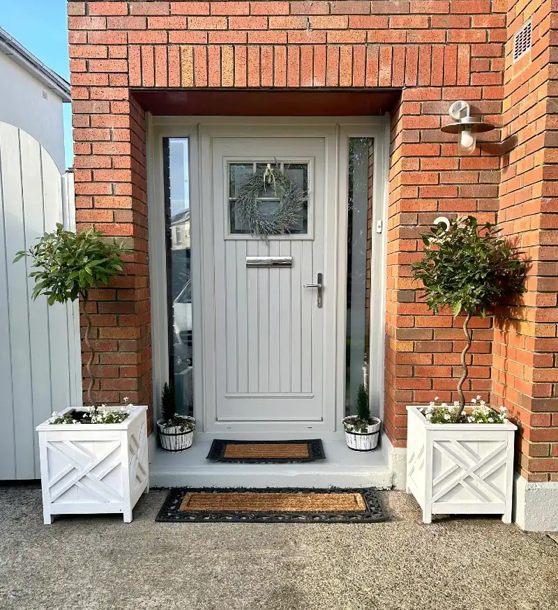
Soft putty door sits neatly within the red brick opening, framed by narrow glass sidelights and a shallow recessed porch. Vertical paneling, a small square window, silver hardware, and a wispy wreath keep the design crisp, while matching white planter boxes bring balance on both sides.
A pale neutral door can calm strong brick while still making the entrance feel fresh and defined.
This shade works because its gray beige undertone relates to the mortar and concrete without blending into either one. Repeating white in the planters and trim brightens the entry, while clipped topiary trees add shape without crowding the doorway.