
A rented kitchen can still feel warm, crisp, and personal. Light bounces off a fresh backsplash. Coffee smells better when the wall behind it looks clean, bright, and cared for.
Peel-off backsplash ideas make that change feel low risk. They cover old tile, dull paint, and awkward gaps without grout, dust, or landlord stress. You can try color, pattern, stone looks, or glossy tile styles in one afternoon.
These ideas bring charm without the big bill. Some feel airy and soft. Others add drama, texture, or a sharp focal point. Let’s look at smart ways to make a rental kitchen feel more finished.
Peel, Press, Refresh
Built-in looking backsplash ideas for renters, small kitchens, and quick upgrades that feel polished instead of temporary.
Match the Kitchen Mood
Choose a finish that feels intentional: glossy subway tile for bright kitchens or matte stone prints for a calmer look.
Prep Before You Press
Clean the wall, test a small corner, and line up the first sheet carefully. One straight start makes the whole wall feel custom.
Pick Clean-Release Panels
For rentals, look for adhesive tiles labeled removable or clean release on painted walls before you cover a full zone.
Add Depth Without Real Tile
Faux zellige, beadboard, and marble-look sheets give the wall texture and shadow without grout, tools, or a permanent install.
Use One Color Anchor
Pull one shade from the counters, cabinets, or hardware so the backsplash feels connected, not randomly added.
Cover the High-Impact Zone
Save sheets by covering only the stove wall or sink area. A focused update gives you maximum visual payoff for less money.
Peel, Press, Refresh: Backsplash Ideas That Feel Built In
A peel-off backsplash works best when it looks intentional, not rushed. Match the finish to your kitchen’s mood. Glossy subway tile suits bright spaces, while matte stone prints feel calmer and more grounded.
Prep matters more than most people think. Clean the wall, test a small corner, and line up the first sheet with care. One straight starting point can make the whole wall feel polished.
- Renter Tip: Choose removable panels or adhesive tiles labeled for clean release on painted walls.
- Texture: Use faux zellige, beadboard, or marble-look sheets when you want depth without real tile.
- Color Anchor: Pull one shade from your counters, cabinets, or hardware so the backsplash feels connected.
- Budget Tip: Cover only the stove wall or sink zone for a high-impact update with fewer sheets.
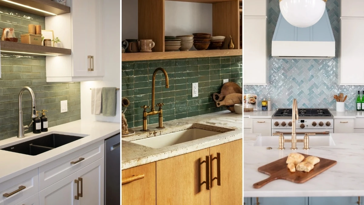
1. Deep Green Vertical Tile Backsplash Behind Cream Cabinet Sink Station
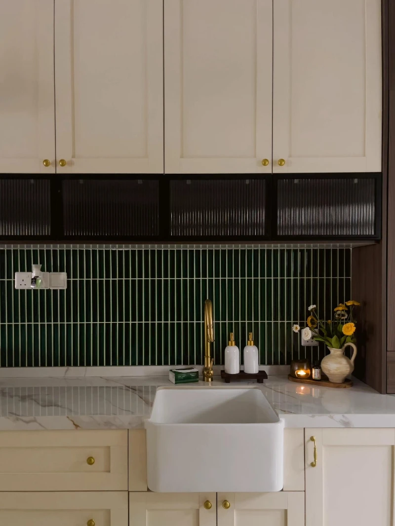
Cream cabinets line the kitchen wall with soft, inset panel detailing and small brass knobs that catch the light. A band of deep green vertical tiles runs across the backsplash, creating a narrow, rhythmic pattern behind the sink and counter. Above it, ribbed dark glass cabinets add texture, while a white farmhouse sink sits centered under a slim marble countertop.
Bold Insight Line: Vertical tile lines instantly pull the eye upward and make a compact kitchen feel taller and more structured.
The contrast between warm cream cabinetry and rich green tiles gives the space quiet depth without feeling heavy. Brass fixtures and small decor pieces like soap bottles and a vase of fresh flowers add life without cluttering the surface.
Start with a strong color strip behind the sink to create a focal zone. This is where peel-and-stick backsplash works best because it anchors the hardest-working part of the kitchen.
- Lighting: Soft under-cabinet lighting helps glossy tiles reflect depth instead of looking flat.
- Texture: Ribbed glass above the backsplash adds layered surface interest without extra decor.
- Color Anchor: Deep green ties back to natural tones, keeping cream cabinets from feeling plain.
- Renter Tip: Focus peel panels only along the sink run for easy removal and lower cost.
2. Rustic Wood Shelf Kitchen with Handmade Green Tile Backsplash and Brass Faucet
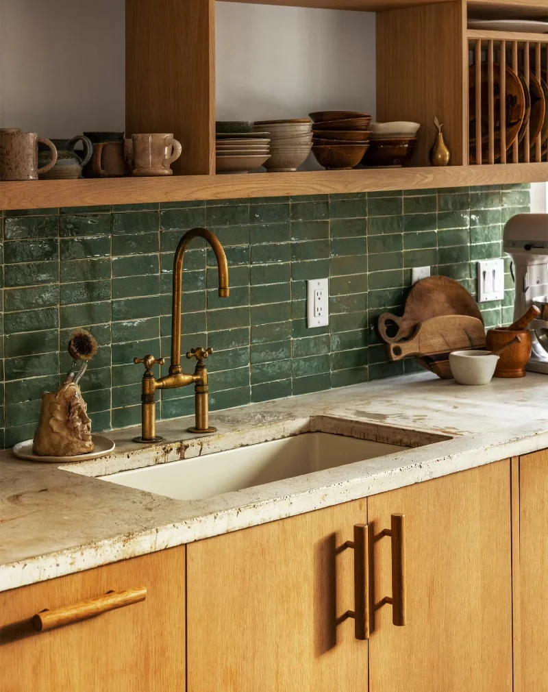
Warm oak shelving stretches across the top of the kitchen, holding stacked ceramic bowls, mugs, and simple stoneware in earthy tones. Below, a deep green handmade tile backsplash runs horizontally with slight variations in glaze that catch soft light. A brass faucet rises over a worn stone countertop and a farmhouse-style sink, surrounded by wooden cutting boards and small kitchen tools.
Bold Insight Line: Handmade-look tiles add movement and depth, making a rental backsplash feel custom without permanent work.
Natural wood and green tile sit close in tone, so the whole wall feels calm but layered. The imperfect surface of the tiles breaks up the clean lines of the cabinets and gives the kitchen a lived-in character.
This is a strong example of how peel-and-stick tiles can carry texture even when everything else is simple. The key is choosing finishes that feel slightly irregular so the wall does not look flat or mass-produced.
- Lighting: Warm overhead light enhances the glaze variations in each tile.
- Texture: Handmade-style tiles create subtle uneven reflections that feel authentic.
- Color Anchor: Deep green connects naturally with wood tones for a grounded palette.
- Statement Piece: Brass faucet adds a soft metallic highlight without overpowering the space.
3. Under Cabinet LED Glow with Sage Green Subway Tile Backsplash and Floating Wood Shelves
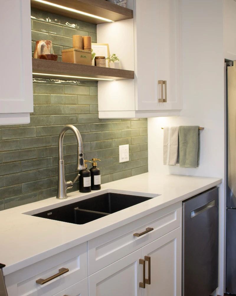
Soft sage green subway tiles line the wall behind a clean white countertop, their glossy surface catching the warm under-cabinet LED lighting. Above, floating wood shelves hold neatly stacked ceramics, small jars, and a few styled kitchen accents that feel practical and calm. A stainless steel faucet and deep black sink sit at the center, anchoring the composition with contrast and structure.
Bold Insight Line: Layered lighting over glossy tile turns a simple backsplash into a warm focal wall after dark.
This setup shows how peel-and-stick backsplash ideas can feel high-end when paired with lighting and open storage. The green tiles already bring depth, but the LED strips add a soft wash that makes the wall feel more dimensional and lived in.
Balance is doing most of the work here. Light cabinetry keeps the space open, while darker sink and hardware ground the look so it doesn’t feel flat or overly minimal.
Why This Works
- Lighting: Under-shelf LED strips highlight tile texture and create evening warmth without extra decor.
- Material Contrast: Glossy tiles against matte wood shelving prevent the wall from feeling one-note.
- Functional Styling: Everyday kitchen items double as decor when grouped neatly on open shelves.
- Color Harmony: Sage green sits between warm and cool tones, making it flexible for most rental kitchens.
4. Walnut Wood Kitchen Wall with Teal Mosaic Backsplash and Island Seating
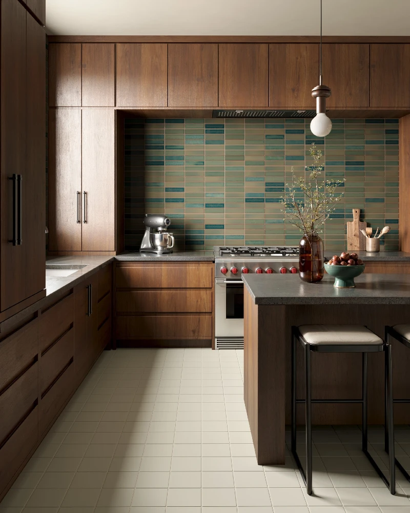
Dark walnut cabinets wrap the kitchen in a strong, grounded tone with clean flat panels and minimal hardware. A teal and muted green mosaic backsplash sits inside a recessed cooking wall, creating a framed focal zone that feels intentional and architectural. In front, a matching walnut island extends outward with a stone countertop and two stools, while a single pendant bulb hangs low to soften the space.
Bold Insight Line: Framing your backsplash inside wood cabinetry turns even peel-and-stick tiles into a built-in design feature.
The backsplash reads like a dedicated “art panel” because it is contained within a wood surround. That trick makes pattern or color feel more expensive and less temporary, even in a rental setup. The mix of teal tones also breaks up the heaviness of the wood so the wall does not feel closed in.
This layout works especially well in kitchens where you want contrast without chaos. The tile becomes the main character, while everything else supports it quietly.
- Lighting: A single warm pendant softens the darker wood and keeps the backsplash from feeling too heavy.
- Focal Point: Recessed cooking wall naturally frames the peel-style tile, making it feel custom installed.
- Color Anchor: Teal tones balance the deep walnut and prevent the space from leaning too dark.
- Texture: Mosaic variation adds movement across the wall so flat cabinetry feels more dynamic.
5. Glossy Black Subway Tile Kitchen Wall with Warm Wood Shelf and Brass Hardware Accents
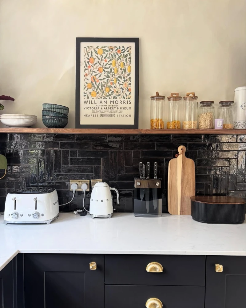
A deep black subway tile backsplash runs across the wall, its glossy surface reflecting light in soft, uneven patches. Above it, a thick wood shelf holds ceramic bowls, glass jars filled with pantry staples, and a framed botanical print that brings a gentle, homey feel. On the counter, a white toaster, kettle, and knife block sit neatly against the dark tile, while black lower cabinets are finished with small brass pulls.
Bold Insight Line: High-gloss dark tile becomes far more inviting when balanced with warm wood and soft, everyday objects.
The contrast here is doing the heavy lifting. Dark tile can feel intense on its own, but the wood shelf breaks it up and keeps the wall from feeling closed in. Light appliances and natural textures soften the overall mood so it stays practical, not heavy.
This is a strong rental-friendly direction for anyone who wants drama without commitment. Peel-and-stick glossy black tiles can mimic this effect instantly when paired with the right styling on top.
Quick Styling Tips
- Budget version: Use peel-and-stick black subway tiles only on the stove or sink section for a controlled focal wall.
- Renter tip: Keep shelves freestanding or removable so the backsplash remains the only wall change.
- Pro move: Mix matte appliances with glossy tile to create depth instead of a flat dark surface.
6. Blue Shaker Island Kitchen with Vertical Stripe Tile Backsplash and Warm Wood Accents
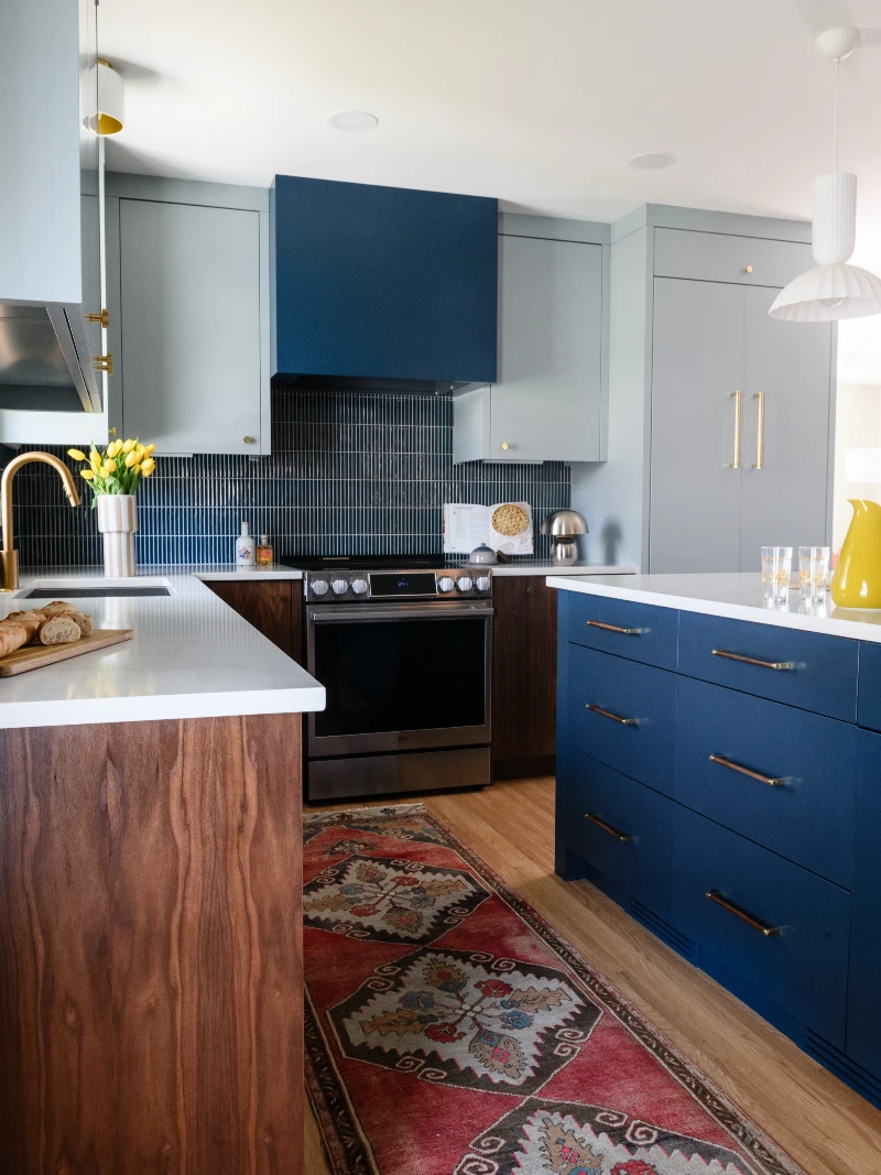
Cool blue cabinetry anchors the kitchen island, paired with slim brass handles that add a soft metallic line across each drawer. Behind the stove, a vertical striped tile backsplash in muted blues and grays creates a structured rhythm that draws the eye upward. Warm wood tones on the surrounding cabinets and a patterned runner rug soften the overall contrast across the space.
Bold Insight Line: Vertical stripe tile patterns can visually stretch a backsplash and make even bold color palettes feel more controlled.
This kitchen balances cool and warm elements in a way that feels intentional rather than busy. The blue island brings depth, while the wood surfaces keep the room from drifting too cold or overly modern. Peel-and-stick vertical tile designs would work especially well here because the pattern does most of the visual work.
The key is restraint. When color is strong, pattern should stay consistent and directional so the wall reads as one unified surface instead of broken sections.
- Lighting: Bright ceiling light keeps the blue tones crisp instead of muted or heavy.
- Texture: Vertical tile striping adds movement without introducing extra color noise.
- Color Anchor: Deep blue cabinetry ties directly into the backsplash for a cohesive focal zone.
- Renter Tip: Use peel panels only behind the cooking range to recreate a framed backsplash effect without full-wall commitment.
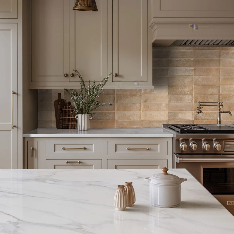
7. Soft Stone Texture Backsplash with Light Cream Cabinets and Stainless Range Hood
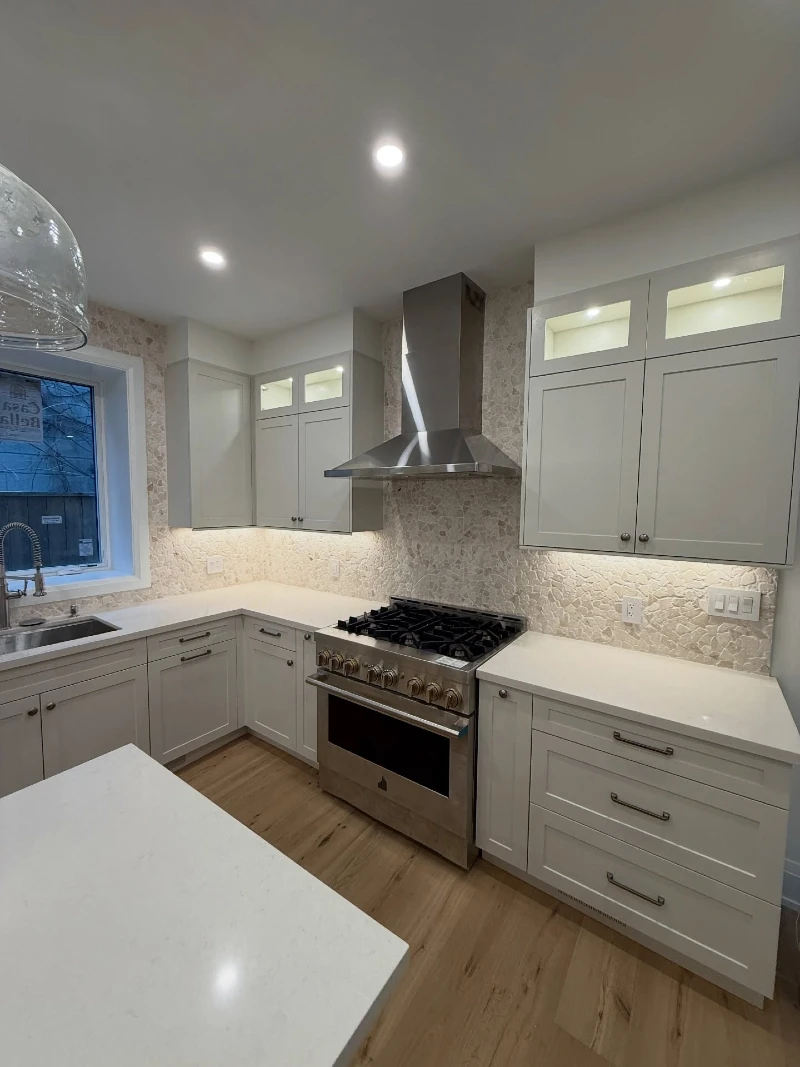
A soft stone-textured backsplash runs across the entire kitchen wall, bringing a subtle, natural pattern that feels calm and grounded. Light cream shaker cabinets frame the space, paired with a sleek stainless steel range hood that sits as the visual center point. Recessed ceiling lights wash the room evenly, while warm wood flooring adds contrast under the clean white countertops.
Bold Insight Line: Subtle stone-texture backsplash patterns create quiet depth without overpowering a clean, modern kitchen.
This is a great example of how peel-and-stick backsplash designs don’t always need bold color to make an impact. The texture alone carries the design, especially when the rest of the kitchen stays minimal and bright. The result feels open, but not empty.
The key here is restraint. Everything is kept light, so the backsplash becomes a soft backdrop instead of a loud feature wall. That makes the kitchen feel more expensive and intentionally designed.
- Lighting: Even recessed lighting highlights the fine texture without creating harsh shadows.
- Texture: Stone-like surface detail adds dimension while staying visually soft and neutral.
- Color Anchor: Cream cabinetry and white counters keep the palette cohesive and airy.
- Renter Tip: Choose neutral peel tiles when you want a long-term look that won’t clash with future decor changes.
8. Soft Blue Herringbone Backsplash with Brass Faucet and White Island Centerpiece
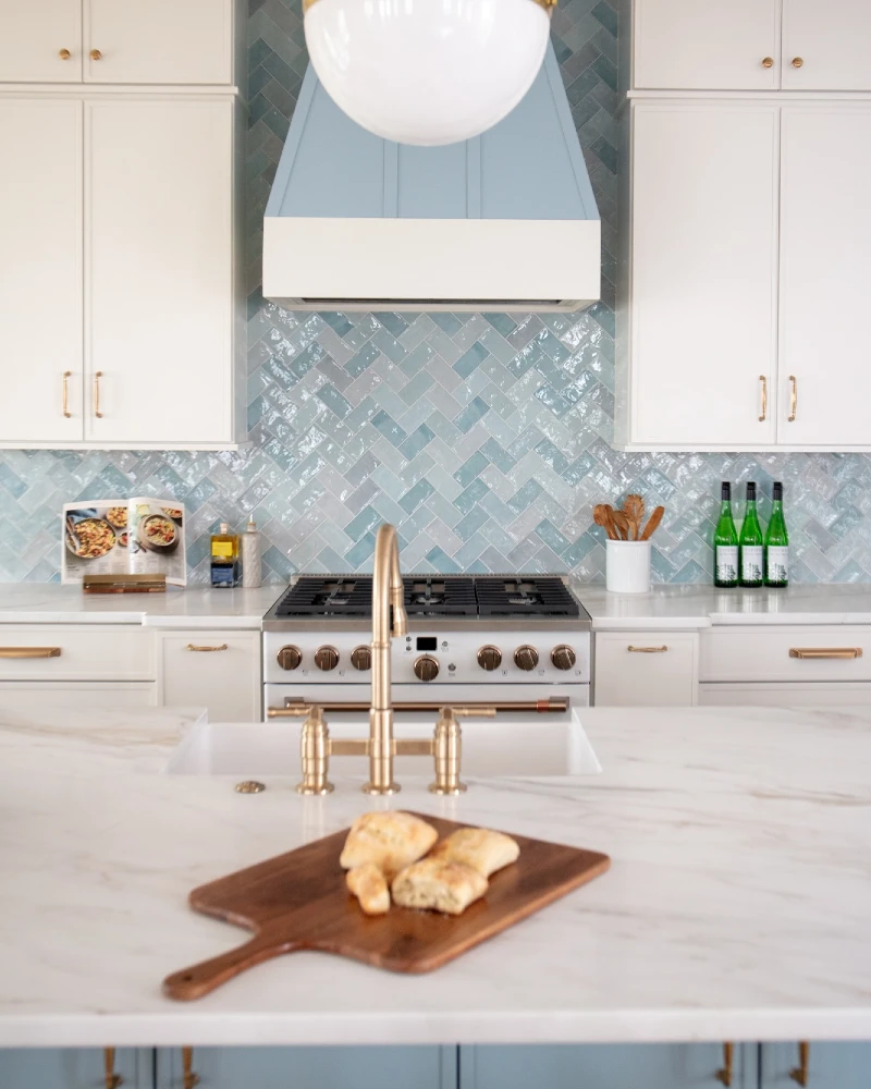
Pale blue herringbone tiles stretch across the cooking wall, shifting slightly in tone as they catch the light from above. White shaker cabinets frame the space on both sides, while a sculptural range hood sits centered like a clean architectural block. In the foreground, a white marble island holds a wooden board with fresh bread, paired with a brushed brass faucet that anchors the sink area.
Bold Insight Line: Herringbone tile instantly adds movement, even in soft colors, making a rental backsplash feel custom-built.
This layout shows how pattern can carry a kitchen without needing bold color. The soft blue keeps things airy, while the directional tile pattern adds energy and flow. Even in a simple rental setup, that subtle movement makes the wall feel intentionally designed.
Brass fixtures are doing quiet work here, warming up the cool tile so the kitchen doesn’t drift too cold. The overall balance stays light, clean, and very easy to live with.
- Lighting: Overhead pendant light enhances tile gloss and emphasizes the herringbone direction.
- Pattern Direction: Diagonal tile layout creates motion and breaks up flat wall surfaces.
- Color Anchor: Soft blue ties into white cabinetry for a calm, cohesive palette.
- Renter Tip: Peel-and-stick herringbone sheets can replicate this look without grout or permanent installation.
9. Multicolor Vertical Tile Backsplash with Green Island and Eclectic Open Shelf Styling
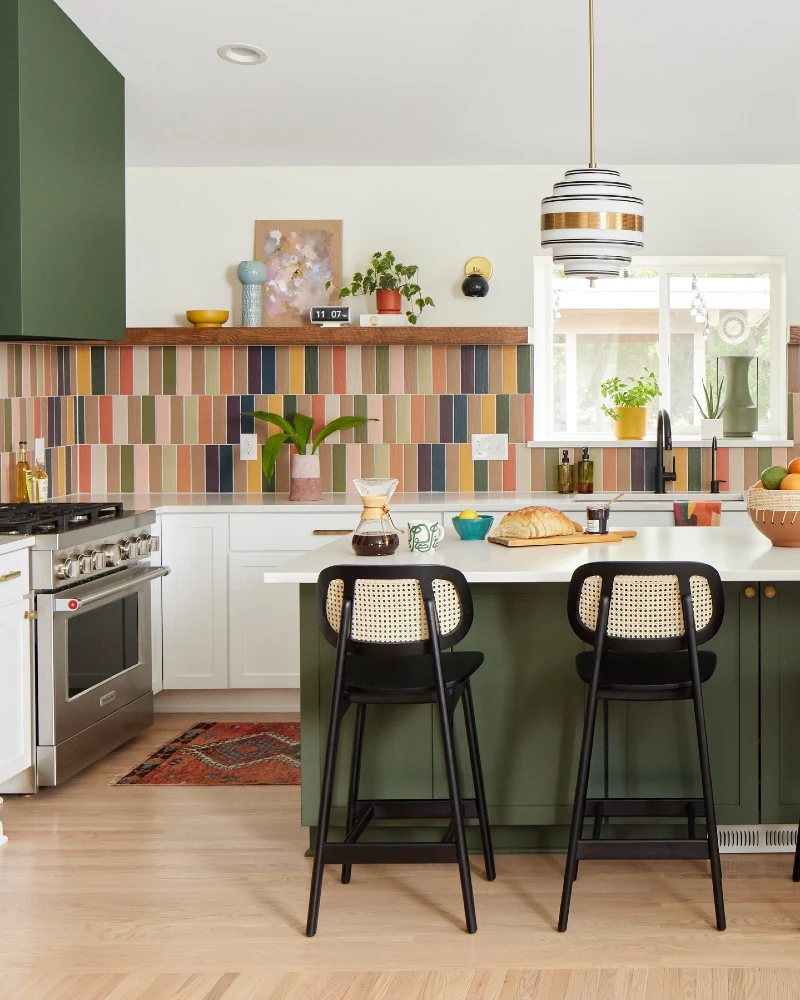
Vertical tile strips in mixed earthy tones line the backsplash wall, creating a bold rhythm of warm rust, muted blue, soft green, and sandy beige. A deep green kitchen island sits in front with black bar stools, while white countertops and open shelving keep the space from feeling visually heavy. Above, small decor pieces, framed art, and plants are arranged loosely to add personality without strict symmetry.
Bold Insight Line: Mixing color in vertical tile strips turns a backsplash into a built-in design feature instead of just a background surface.
This kitchen leans into controlled contrast. The backsplash brings energy, but the surrounding white cabinetry and open spacing keep it grounded. Nothing feels random because the color palette repeats across small accents like plants, ceramics, and artwork.
For rental-friendly ideas, this is where peel-and-stick really shines. A multicolor tile effect can completely shift the mood of a kitchen without touching cabinets or layout.
- Lighting: Soft natural light keeps the varied tile colors from feeling too saturated or chaotic.
- Pattern Rhythm: Vertical striping organizes multiple colors into a structured visual flow.
- Color Anchor: Green island ties back to the backsplash tones and keeps the palette unified.
- Renter Tip: Choose peel tiles with repeating color families so the mix still feels intentional, not scattered.
10. Warm Taupe Subway Tile Backsplash with Soft Cream Cabinets and Brass Range Details
Soft taupe subway tiles line the backsplash wall in a calm horizontal layout, creating a warm, neutral surface that gently reflects light without overpowering the kitchen. Cream shaker cabinets frame the space with subtle detailing and brass hardware that adds a soft metallic rhythm. A professional-style range sits beneath a traditional-style hood, while the marble island in the foreground introduces a cooler contrast that keeps the palette balanced.
Bold Insight Line: Warm neutral backsplash tones create depth when paired with brass accents and layered cream cabinetry.
This kitchen is all about controlled warmth. The backsplash doesn’t compete for attention; instead, it supports the cabinetry and hardware so the whole space feels cohesive. Even in a rental, peel-and-stick taupe tiles would replicate this calm, high-end foundation without any permanent changes.
The marble island adds a necessary break in tone, preventing the warm palette from feeling too uniform or heavy.
- Lighting: Soft overhead lighting enhances the warm undertones in the taupe tile.
- Texture: Smooth subway tiles contrast with paneled cabinetry for subtle visual structure.
- Color Anchor: Cream and taupe work together to build a consistent, cozy kitchen base.
- Renter Tip: Choose warm neutral peel tiles when you want a long-lasting backsplash that won’t clash with future decor updates.
11. Curved Wood Slat Range Hood with Glossy White Tile Backsplash and Soft Minimal Island Seating
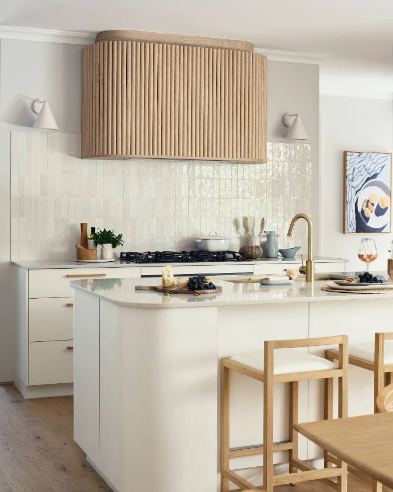
A sculptural range hood wrapped in vertical wood slats sits centered above a clean cooking wall, creating a warm architectural focal point. Behind it, glossy white subway tiles reflect soft daylight and bounce brightness across the neutral kitchen. A white island with light oak stools anchors the foreground, paired with brass faucet details and subtle styling touches like fruit and glassware.
Bold Insight Line: A sculptural hood paired with simple glossy tile turns a basic backsplash into a quiet, high-end focal wall.
This kitchen shows how restraint can feel rich when materials are carefully balanced. The peel-friendly backsplash style here works best in neutral tones because the texture of light reflection becomes the main design feature, not color.
Warm wood, brass, and soft whites keep everything cohesive, so nothing feels visually heavy even with strong architectural elements.
- Lighting: Natural daylight enhances the glossy tile reflection and keeps the space bright and open.
- Texture: Vertical wood slats on the hood add warmth against smooth, reflective tile surfaces.
- Color Anchor: Soft white palette keeps the kitchen calm while allowing material contrast to stand out.
- Renter Tip: Neutral peel-and-stick tiles in glossy white are the safest long-term option for evolving kitchen styles.
12. Classic White Herringbone Backsplash with Ornate Range Hood and Bright Minimal Cabinetry
Bright white cabinetry fills the kitchen with a crisp, structured look, framed by crown molding and clean shaker lines. A classic white herringbone tile backsplash runs across the cooking wall, adding subtle direction and texture without breaking the neutral palette. Centered above the stove, an ornate white range hood becomes a sculptural focal point, blending into the cabinetry while still standing out through its shape.
Bold Insight Line: Even in an all-white kitchen, herringbone pattern adds just enough movement to keep the backsplash from feeling flat.
This space shows how tone-on-tone design can still feel layered when texture does the work. The peel-friendly backsplash style here would rely on pattern rather than color, which makes it ideal for renters who want something timeless and easy to match with future updates.
Everything stays visually light, but not boring. The combination of subtle pattern, structured cabinetry, and soft marble counters keeps the kitchen feeling refined and intentional.
- Lighting: Bright, even lighting highlights the herringbone pattern without creating harsh shadows.
- Pattern Direction: Diagonal tile layout adds movement while staying within a neutral palette.
- Color Anchor: All-white scheme keeps focus on texture and architectural shape instead of color contrast.
- Renter Tip: White peel-and-stick herringbone tiles are the safest choice for long-term flexibility and resale-friendly styling.
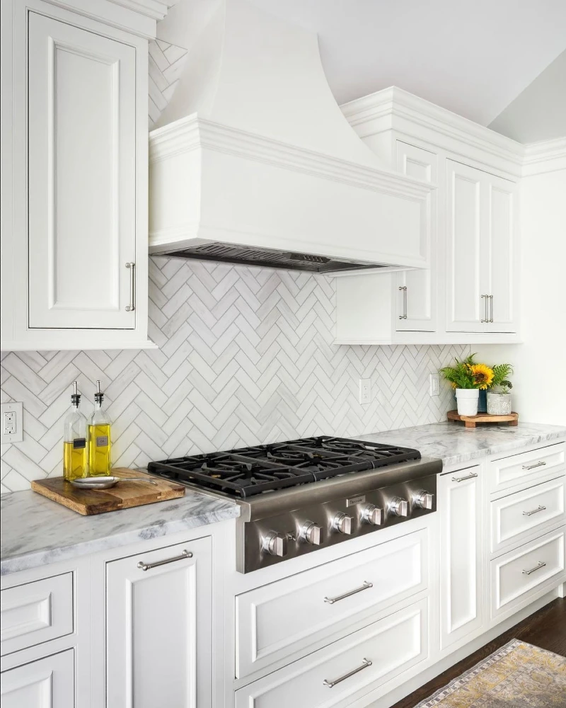
13. Glossy Forest Green Herringbone Backsplash with Wood Range Hood and Bright Window Light
Deep forest green tiles laid in a sharp herringbone pattern cover the entire cooking wall, their glossy surface reflecting sunlight from two tall windows on each side. A chunky wood range hood sits centered above a stainless steel stove, creating a warm architectural block against the rich tile. White cabinetry with slim brass handles frames the scene, while simple kitchen styling like a lemon basket and cutting boards keeps the counter grounded and functional.
Bold Insight Line: Dark herringbone tile feels more balanced when broken up by natural wood and strong daylight sources.
This backsplash works because it combines structure and warmth in equal measure. The tile pattern adds motion, but the vertical symmetry of the hood and cabinets keeps everything visually stable. Even though the green is bold, the sunlight keeps it from feeling heavy or enclosed.
It’s a strong example of how peel-and-stick backsplash ideas can lean dramatic without losing livability. The key is letting light and wood soften the intensity of the color.
Why This Works
- Pattern Control: Herringbone layout creates movement but still feels organized due to tight alignment.
- Natural Contrast: Warm wood hood breaks the visual weight of dark glossy tile.
- Lighting Balance: Large windows prevent the deep green from feeling too enclosed or moody.
- Color Anchor: White cabinetry keeps the composition clean and prevents color overload.
14. Green Marble Stone Backsplash with Walnut Shelf and Stainless Steel Faucet Detail
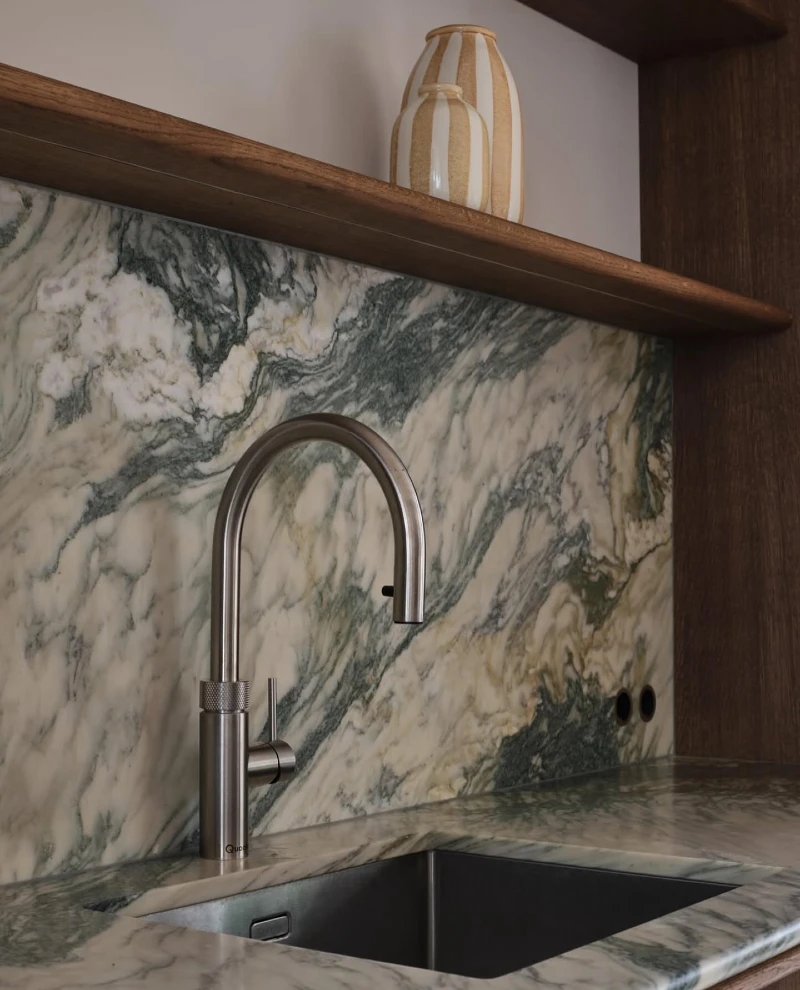
A dramatic slab-style backsplash in swirling green, cream, and charcoal tones runs across the kitchen wall, creating a bold natural stone effect. A warm walnut floating shelf sits above it, holding simple ceramic vases in neutral stripes that soften the intensity of the stone. In front, a stainless steel gooseneck faucet rises from a dark sink, with the marble countertop continuing the same veined pattern for a seamless flow.
Bold Insight Line: Strong stone-pattern backsplashes work best when paired with warm wood and minimal styling to keep the look balanced.
This space feels more like a natural material showcase than a typical kitchen wall. The movement in the stone already acts like artwork, so everything around it stays quiet and controlled. Even in a rental setting, peel-style marble or stone-effect panels can recreate this layered luxury without permanent installation.
The walnut shelf is doing subtle grounding work. It breaks the intensity of the stone just enough to keep the eye from being overwhelmed.
- Lighting: Soft, indirect light helps the stone veining appear deeper and more dimensional.
- Texture: Natural marble-style movement replaces the need for extra wall decor or pattern.
- Color Anchor: Walnut wood introduces warmth that balances the cool green and cream tones.
- Renter Tip: Use marble-look peel panels only on the backsplash zone to mimic slab stone without renovation cost.
15. Sculpted Emerald Geometric Tile Backsplash with Walnut Cabinets and Vertical Wood Hood Trim
Deep emerald tiles form a bold geometric pattern across the backsplash, creating a layered, almost architectural surface that shifts as light hits each angle. Warm walnut cabinetry surrounds the space, with strong vertical grain that adds depth and richness to the kitchen walls. A wood-wrapped range hood sits centered above the stove, while brass handles and soft white counters keep the composition balanced and refined.
Bold Insight Line: Geometric tile patterns bring instant structure to a kitchen wall, even when the color palette is already bold.
This backsplash feels more dimensional than flat tile because of its repeating sculpted shape. The pattern naturally catches highlights and shadows, which means the wall looks alive even without decor changes. For a rental-friendly version, peel-and-stick textured tiles can mimic this effect without grout or permanent installation.
The wood elements are essential here. Without them, the green could feel heavy, but walnut warms everything and gives the design a grounded, high-end finish.
- Lighting: Soft overhead lighting enhances the raised edges of the geometric tile pattern.
- Texture: Sculpted tile surfaces create depth through shadow play rather than color variation.
- Color Anchor: Emerald green and walnut wood create a rich, natural contrast that feels intentional.
- Renter Tip: Choose 3D-style peel tiles in small sections behind the stove to create a framed feature wall effect.
16. Sage Green Shaker Kitchen with White Subway Tile Backsplash and Open Shelf Styling
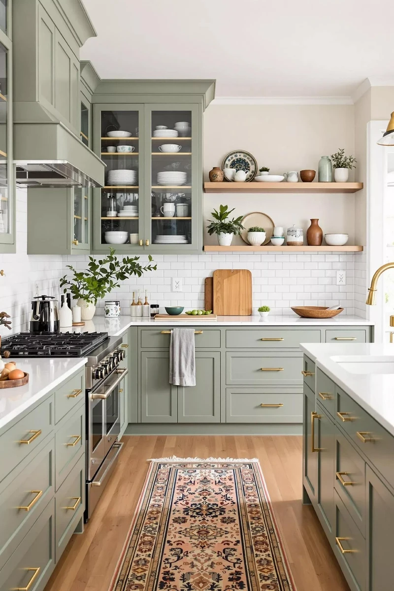
Soft sage green shaker cabinets line the kitchen in a clean, structured layout, paired with slim brass handles that add a warm metallic rhythm across the drawers and doors. A classic white subway tile backsplash runs across the entire wall, creating a bright and uniform backdrop that keeps the space feeling open. Above the counter, floating wood shelves hold ceramic bowls, vases, and small plants, adding a relaxed, lived-in layer of styling.
Bold Insight Line: A simple white backsplash becomes more elevated when paired with soft cabinet color and natural wood shelving.
This kitchen works because everything feels balanced instead of competing. The backsplash stays neutral and clean, which allows the sage cabinetry and wood accents to carry the personality. Even in a rental setting, this kind of peel-friendly subway tile is a safe foundation that can adapt to changing decor styles.
The open shelving is doing quiet but important work here. It breaks up the solid cabinet blocks and makes the wall feel lighter and more curated without being cluttered.
- Lighting: Soft natural light keeps the white tiles bright without creating harsh glare.
- Texture: Smooth subway tiles contrast with matte cabinetry and warm wood shelving.
- Color Anchor: Sage green cabinets act as the main color base while neutrals support it.
- Renter Tip: Classic white peel subway tiles are the easiest long-term rental upgrade because they match any future color scheme.
17. Ornate Blue Spanish Tile Backsplash with White Cabinets and Rustic Wood Counter Corner
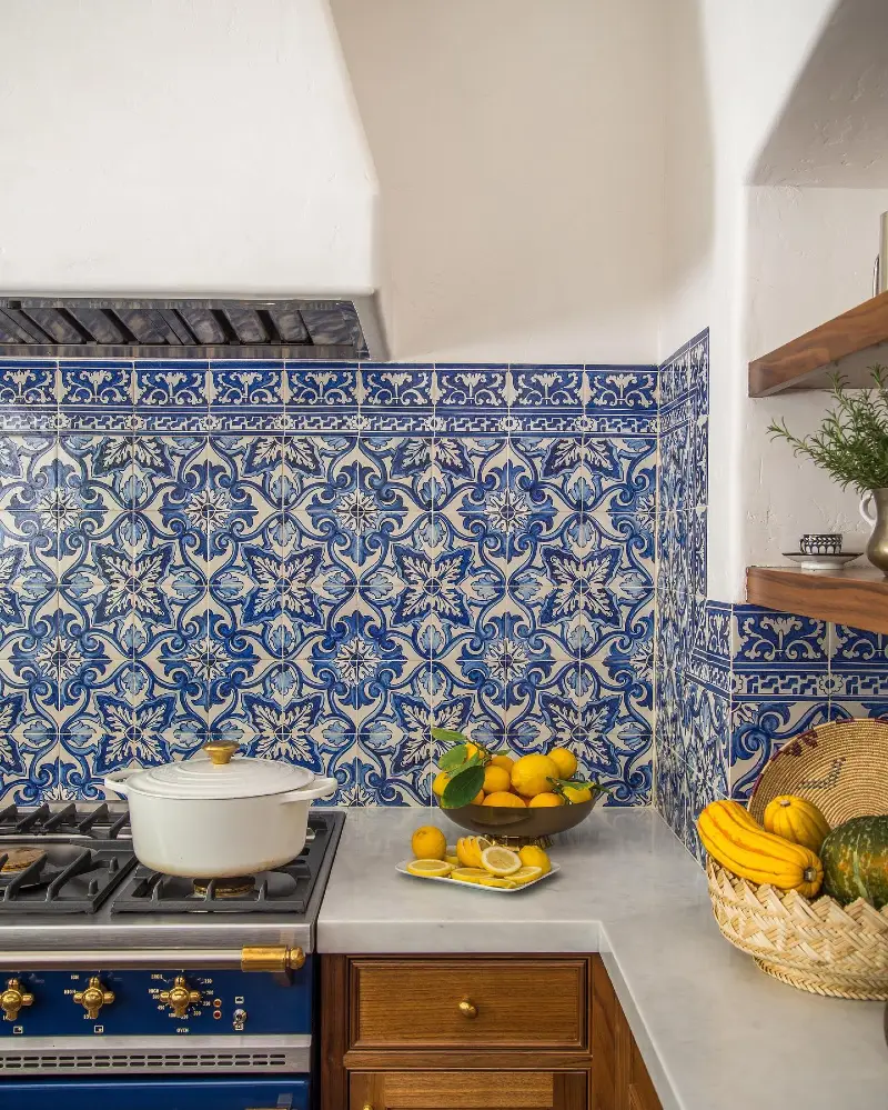
Intricate blue and white patterned tiles cover the backsplash wall, forming a repeating ornamental design that feels rich and traditional. A white plaster range hood blends into the wall above, while a stainless vent sits underneath, keeping the focus on the tile work. On the counter, warm wooden accents like a cutting board and fruit bowl soften the strong pattern with natural texture and color.
Bold Insight Line: Highly decorative tile patterns work best when the surrounding kitchen stays simple and quiet.
This backsplash brings strong visual energy, so everything around it stays minimal and balanced. The white cabinetry and light plaster hood give the pattern space to breathe, preventing the design from feeling crowded. Even in a rental setting, peel-and-stick versions of ornate tiles can recreate this European-inspired look without permanent commitment.
The key here is contrast control. The boldness of the pattern is offset by clean surfaces and warm wood, so the kitchen feels expressive but still livable.