
A good men’s studio apartment feels sharp, calm, and easy to move through. The air feels open. The light hits clean lines, dark wood, soft cotton, and one or two strong pieces that make the room feel grown up.
Small square footage can work hard when every item has a job. A bed can hide storage. A desk can double as a dining spot. A slim shelf can divide the room without making it feel boxed in.
In this article, you’ll see smart ways to shape one room into a place to sleep, work, eat, and relax without clutter taking over.
Living Large in One Room: Smart Layers for a Masculine Studio
Start with zones, not more furniture. Use a rug to mark the living area, a low shelf to frame the bed, and wall lighting to free up surface space. This keeps the room useful without making it feel crowded.
Choose a tight color story and repeat it across the space. Charcoal, oak, black metal, olive, and cream all work well together. The room feels more settled when each finish appears more than once.
- Lighting: Use wall sconces, floor lamps, and warm bulbs to create depth without stealing table space.
- Texture: Mix leather, linen, wood, and metal so the room feels grounded instead of flat.
- Color Anchor: Pick one dark shade, such as charcoal or deep brown, and repeat it in small doses.
- Renter Tip: Use freestanding shelves, peel-and-stick hooks, and plug-in lights to build function without drilling.
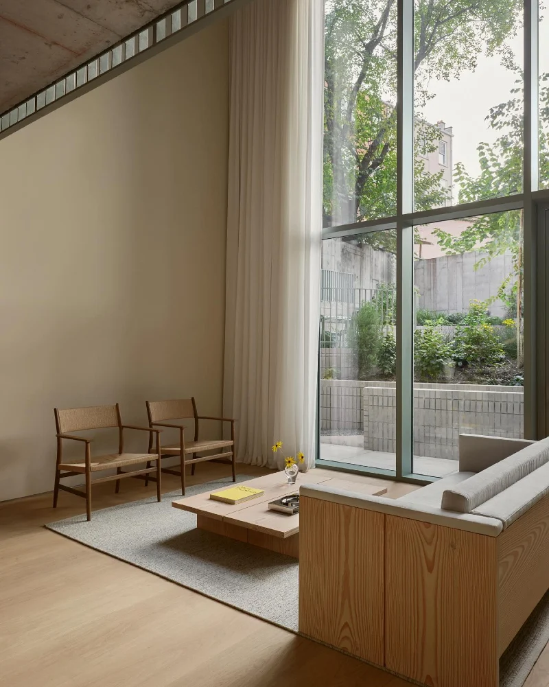
1. Floor-to-Ceiling Glass Doors with Light-Drenched Living Zone
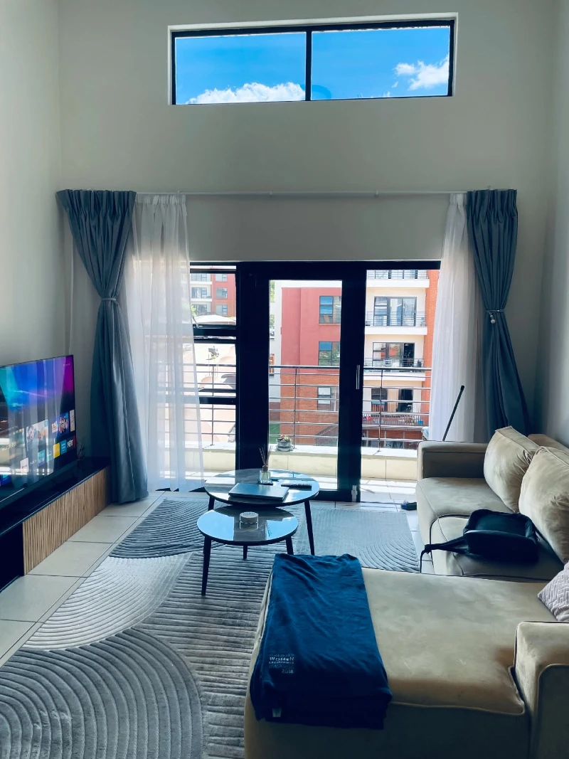
This space opens up around tall glass doors that pull in daylight and make the entire studio feel taller than it is. Soft grey curtains frame the opening on both sides, falling in clean vertical folds that guide the eye upward. A beige sectional sits low and grounded, paired with a simple round coffee table that keeps movement easy. The palette stays calm—grey rug, muted sofa, and pale walls—so the outside view becomes part of the decor.
Vertical light and clear sightlines make a compact room feel twice as open.
The layout works because nothing blocks the window wall, allowing light to travel deep into the room. Even the TV corner stays visually light, so the focus remains on openness rather than furniture density.
- Lighting: Full-height windows maximize daylight, reducing the need for heavy artificial lighting during the day.
- Layering: Sheer curtains soften harsh sunlight while keeping the space visually open and airy.
- Focal Point: The outdoor view becomes the main “art piece,” reducing the need for wall clutter.
- Renter Tip: Use tension rods or ceiling-mounted tracks to achieve high curtain placement without permanent changes.
2. Sculptural Warmth with Fireplace Glow and Soft Vintage Layers
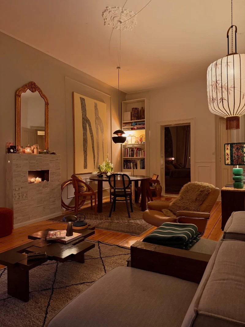
This room leans into warmth with a soft amber glow bouncing across pale walls and polished wood floors. A compact fireplace anchors the left side, framed by textured stone and small candlelight flickers that add movement to the stillness. At the center, a round dining table sits under a pendant light, surrounded by mixed seating that feels collected over time. Art, books, and sculptural decor pieces give the walls a lived-in character without visual clutter.
Warm lighting turns a small studio into a slow, calming retreat instead of just a living space.
The layered lighting is doing most of the design work here. Nothing is loud, yet every corner feels intentional, from the glowing fireplace niche to the suspended pendant drawing attention downward.
Why This Works
- Lighting Layers: Multiple light sources create depth, so no single corner feels flat or empty.
- Mixed Seating: Different chair styles add personality while keeping the footprint flexible for small spaces.
- Warm Palette: Beige, wood, and amber tones visually compress chaos and make the room feel grounded.
- Vertical Art Placement: Tall artwork draws the eye upward, making the ceiling feel higher than it is.
3. Exposed Concrete Divider with Soft Minimal Living Zone and Kitchen Flow
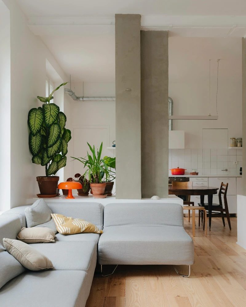
This layout uses a tall raw-concrete column as a visual spine that splits the studio without fully closing it off. The living area stays soft and calm with a light grey sectional, warm wood flooring, and scattered plants that bring in a fresh, organic contrast. On the other side, the kitchen and dining zone feel clean and functional, anchored by white tiles, simple cabinetry, and a round wooden table that keeps movement easy. Small color hits—like the orange lamp and red cookware—add energy without breaking the muted palette.
One strong architectural element can organize an entire studio better than extra furniture ever will.
The concrete divider does the heavy lifting here. It defines space, guides flow, and creates natural zones while still keeping sightlines open across the entire apartment.
- Focal Point: The concrete column acts like a natural room divider without closing the layout.
- Color Anchor: Soft neutrals dominate, while small warm accents keep the space from feeling sterile.
- Layering: Plants and textiles soften the hard industrial structure for balance.
- Renter Tip: Use freestanding partitions or shelving units to recreate zoning without permanent construction.
4. Low-Profile Platform Bed with Monochrome Wall Art and Shadow Lighting
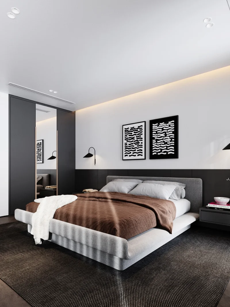
This bedroom keeps everything tight, controlled, and visually quiet. A low platform bed sits centered on a dark textured rug, wrapped in a soft brown throw that adds warmth to the otherwise monochrome palette. The wall behind it is split into clean black and white sections, finished with graphic art pieces that echo each other in rhythm. Slim wall sconces float on either side, casting soft directional light that keeps surfaces clear and uncluttered. A sliding wardrobe with a full mirror reflects depth back into the room, making the compact layout feel more open.
Low height furniture and strict contrast control make a small bedroom feel structured, not cramped.
The strength of this setup is restraint. Every element sits close to the ground, which visually raises the ceiling and stretches the room horizontally without adding bulk.
Quick Styling Tips
- Budget version: Use a simple platform bed frame and removable wall prints to recreate the monochrome effect without renovation.
- Renter tip: Stick-on wall sconces and peel-and-place wardrobe panels keep the look reversible.
- Pro move: Add indirect LED strip lighting behind the headboard to create a soft floating glow.
5. Brick-Textured Accent Wall with Warm Curtains and Plant-Softened Bed Zone
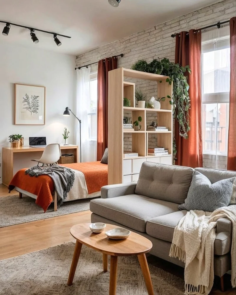
This studio blends texture and warmth in a very controlled way. A light brick accent wall runs across the sleeping zone, giving the space subtle depth without overwhelming the small footprint. Rust-toned curtains frame the tall windows and bring a warm contrast against the pale walls. A simple wooden bed sits centered, dressed in layered orange and neutral bedding that ties into the curtain color. A freestanding shelf divider in light wood breaks the room gently, filled with books and trailing plants that soften its structure.
Repeating warm tones across fabric and decor turns a small studio into one continuous, cohesive story.
The key move here is repetition. Orange, wood, and greenery appear in multiple places, so the eye reads the room as one connected flow instead of separate cluttered zones.
Why This Works
- Texture Layering: Brick, linen, and wood add depth without needing extra furniture.
- Natural Divider: The open shelving separates bed and living space while keeping light moving through.
- Color Flow: Rust accents repeat across curtains and bedding for visual unity.
- Vertical Greenery: Hanging plants pull the eye upward, making the ceiling feel taller.
6. Sculptural Paper Pendant with Bookshelf Dining Nook and Warm Modern Collectible Seating
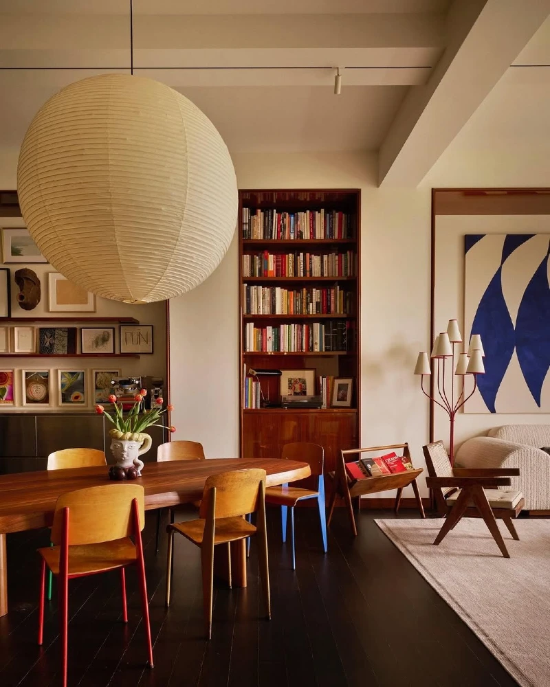
This space feels like a studio apartment that has been edited with intention instead of filled over time. A large paper lantern pendant drops softly from the ceiling, becoming a floating sculptural centerpiece above the dining table. Behind it, a tall built-in bookshelf anchors the wall with dense rows of books, adding both storage and personality. The dining zone uses mixed wooden chairs around a simple table, while the living area flows in with a neutral sofa and warm textile layers. Pops of rust, soft beige, and natural wood keep everything grounded.
A single oversized light fixture can define the entire rhythm of a studio layout.
What makes this work is balance. Heavy storage stays vertical, seating stays low, and lighting becomes the visual bridge that connects both zones without breaking flow.
Why This Works
- Vertical Storage: The tall bookshelf pulls function upward, freeing floor space for movement.
- Soft Statement Lighting: The oversized paper pendant creates presence without adding visual weight.
- Mixed Seating Energy: Different chair styles add personality while keeping the dining zone flexible.
- Warm Neutral Base: Wood and cream tones prevent the studio from feeling visually segmented.
7. Floating Bed Platform with Utility Core and Functional Studio Zoning
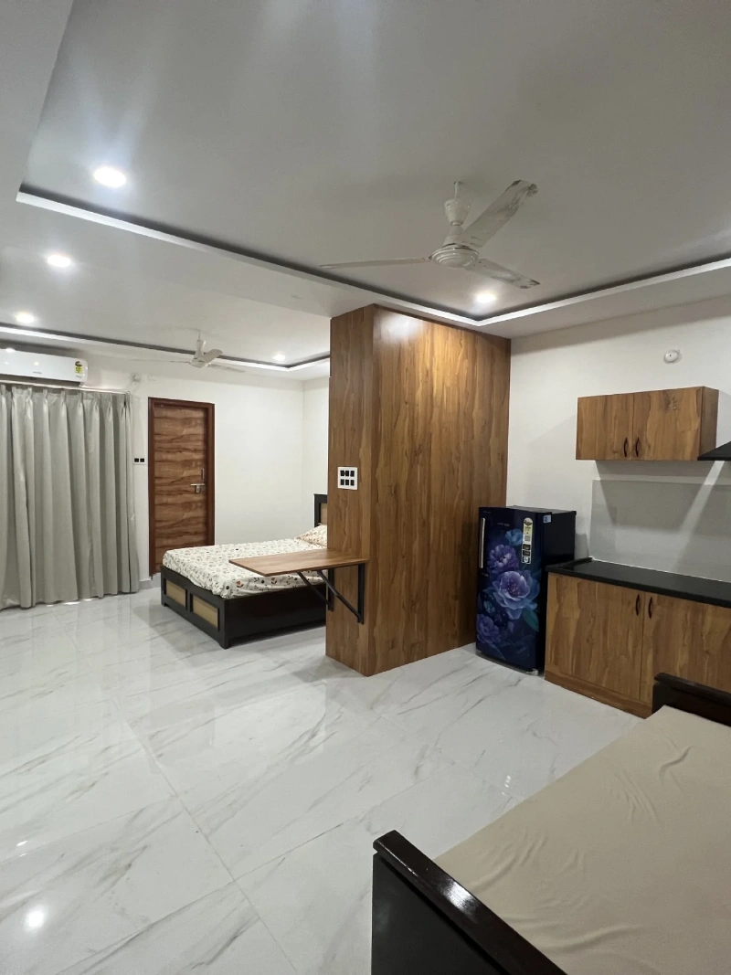
Studio uses a strong central wooden block as an anchor point that divides sleeping, kitchen, and storage zones in a very efficient way. The bed sits slightly raised and pushed into a defined corner, creating a clear sleep area without needing walls. On one side, a compact kitchen runs along clean white cabinetry, while a small dining surface folds out for flexible use. Natural wood finishes dominate the space, paired with glossy white flooring that reflects light and keeps the room feeling open. The ceiling remains simple with recessed lighting and a fan, supporting a practical, no-fuss layout.
A single structural core can organize an entire studio better than multiple partitions ever could.
What makes this layout work is discipline. Every zone is compact, direct, and positioned to avoid wasted circulation space, which is the biggest challenge in small apartments.
Why This Works
- Central Zoning Block: The wooden core acts as a natural divider between sleeping and living functions.
- Foldable Functionality: The drop-down table keeps dining flexible without taking permanent floor space.
- Light Reflection: Glossy flooring helps bounce light across the entire studio, reducing visual weight.
- Compact Flow: Furniture is pushed to edges, leaving the center open for movement and breathing room.
8. Exposed Brick Wall with Reading Desk and Vinyl Storage Corner
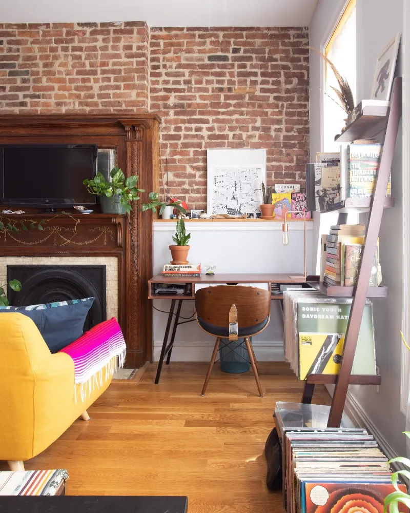
This studio leans into character with a full exposed brick wall that instantly gives the space texture and history. A vintage wooden fireplace frame anchors the left side, softened by small plants and layered decor pieces. In the center, a compact desk sits neatly against a white ledge, styled with books, framed art, and small objects that make the workspace feel personal but not crowded. On the right, a vertical record shelf displays vinyl covers like artwork, adding rhythm and personality to the room. A mustard sofa peeks into the frame, introducing a bold color hit against the warm wood floor.
Mixing raw architecture with personal collections turns a small studio into a space that actually feels lived in.
What makes this setup work is balance. The brick wall carries visual weight, so everything else stays light, organized, and intentionally spaced out.
Why This Works
- Textural Anchor: The exposed brick gives instant depth, so minimal decor still feels rich.
- Personal Display Zones: Books, vinyl, and art are treated like decor, not clutter.
- Compact Workspace: The slim desk keeps functionality tight without stealing floor space.
- Color Contrast: Mustard, wood, and brick create warmth against a neutral base.
9. Dark Wood Paneled Bed Niche with Arched Storage Dresser
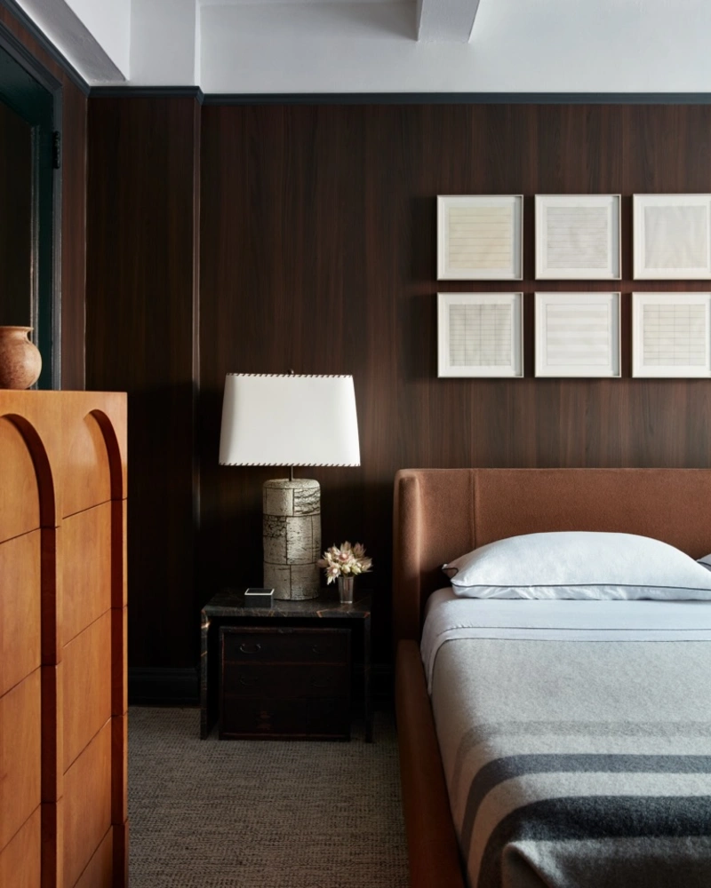
This sleeping zone uses deep wood wall panels to wrap the bed in a rich, quiet backdrop. A warm brown upholstered headboard sits against the dark wall, while pale bedding and a striped grey throw keep the bed from feeling heavy. On the left, the tall wooden dresser adds storage with carved arch details that feel sculptural, not bulky.
Dark walls work in small rooms when the bedding stays crisp and the storage feels intentional.
The smartest move here is contrast. Dense wood, soft fabric, and clean framed art give the bed wall depth without crowding it. To copy the look, keep the palette tight and let one tall storage piece do the hard work.
Quick Styling Tips
- Budget version: Use peel and stick wood panels or dark removable wallpaper behind the bed.
- Renter tip: Hang lightweight framed prints with removable strips to create a clean grid above the headboard.
- Pro move: Choose a narrow tall dresser so storage goes upward instead of eating floor space.
10. Soft White Studio with Geometric Rug and Clean Minimal Wall Grid
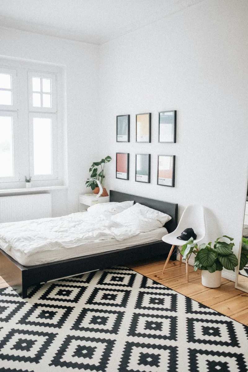
Bedroom leans into pure restraint. White walls, white bedding, and soft daylight create a calm base that feels almost weightless. A simple black bed frame anchors the room, while a geometric black-and-white rug adds rhythm to the floor without breaking the minimal palette. Above the bed, a neat grid of framed prints introduces structure and visual order, each piece evenly spaced so the wall feels intentional, not busy. A single plant near the corner adds a quiet touch of life, softening the sharp lines of the space.
In a minimal studio, repetition and spacing matter more than decoration.
The strength of this design is control. Every object has breathing room, and the contrast between black accents and white surfaces keeps the room crisp without feeling cold.
Why This Works
- Geometric Grounding: The patterned rug defines the sleeping zone without adding clutter.
- Grid Wall Art: Equal spacing creates visual order that makes the room feel structured and calm.
- Monochrome Contrast: Black accents sharpen the soft white base for subtle depth.
- Negative Space: Empty wall and floor areas give the studio its open, airy feel.
11. Soft Grey Upholstered Bed with Rust Throw and Vertical Wood Accent Panel
Bedroom keeps a calm, muted palette with soft grey bedding layered over a simple upholstered bed frame. A warm rust throw introduces just enough contrast to break the cool tones without disturbing the quiet mood. Behind the bed, a vertical wood slat panel adds gentle structure and warmth, acting like a subtle headboard wall. Natural light filters in from the left, softening the matte surfaces and giving the room a balanced, breathable feel. Minimal bedside styling keeps everything intentional—just a small lamp, clean surfaces, and no visual clutter.
Warm accent tones are what stop a grey studio from feeling flat or lifeless.
The design works because it balances cool and warm elements in equal measure. Grey sets the foundation, while wood and rust bring in emotional warmth and depth.
Why This Works
- Vertical Wood Accent: Adds height perception and soft architectural rhythm behind the bed.
- Controlled Color Pop: Rust throw introduces warmth without overpowering the neutral base.
- Minimal Bedside Styling: Keeps the focus on structure and texture rather than objects.
- Light Diffusion: Natural daylight softens grey tones and prevents the space from feeling heavy.
12. Full-Height Window Studio with Light Curtains and Warm Neutral Living Flow
Space feels open before you even notice the furniture. A full-height window floods the room with soft daylight, softened further by sheer white curtains that keep privacy without blocking brightness. The walls stay clean and warm-toned, letting natural light do most of the visual work. On one side, a low-profile sofa sits in a soft beige tone, paired with a simple wooden coffee table that keeps the center of the room light and usable. Two wooden chairs rest quietly in the corner, creating a secondary seating zone without adding bulk. The whole layout leans into air, light, and gentle separation rather than heavy division.
When natural light is this strong, furniture should support it—not compete with it.
The real strength here is restraint. Nothing blocks the window line, so the room reads as one continuous, breathable volume. Even the furniture choices stay low and visually quiet to preserve that openness.
Why This Works
- Floor-to-Ceiling Light: The window becomes the dominant design feature, expanding perceived space.
- Sheer Layering: Curtains soften glare while keeping the studio bright and fluid.
- Low Furniture Profile: Chairs and seating stay visually light to maintain open sightlines.
- Warm Neutral Base: Beige and wood tones prevent the brightness from feeling cold or empty.
13. Cream Wall Molding Bedroom with Contrast Bedding and Classic Black Bed Posts
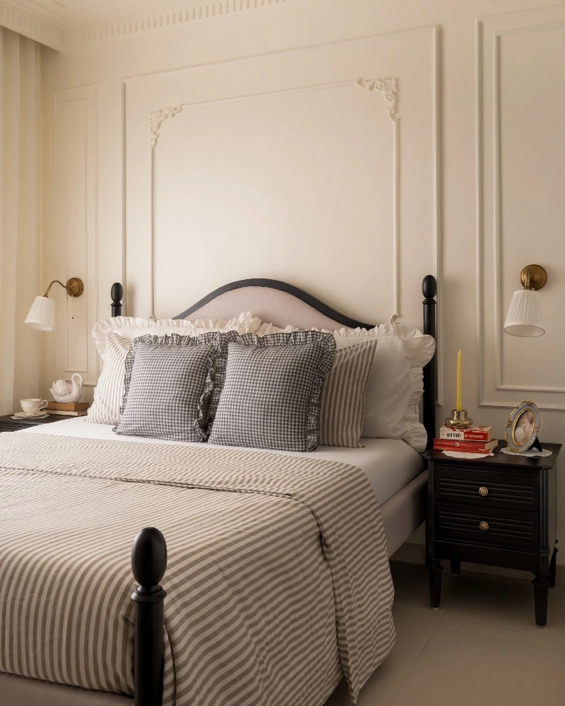
Bedroom keeps a soft, creamy palette that feels calm the moment you enter. Decorative wall molding adds subtle architecture, giving plain walls a sense of depth without heavy decoration. The bed sits low and structured with black posts that create gentle contrast against the light surroundings. Bedding stays layered in simple tones—white sheets, striped neutrals, and a textured throw—so the focus stays on shape and proportion rather than pattern. Matching wall sconces on both sides keep the lighting soft and balanced, while a compact bedside table holds just a few essentials, keeping the surface clean.
Architectural wall detail is what turns a simple bedroom into a space that feels designed, not just furnished.
The strength of this setup is quiet structure. Instead of relying on color or clutter, it uses molding, symmetry, and contrast to create a calm but intentional composition.
Why This Works
- Wall Molding Depth: Decorative panels add subtle luxury without overpowering the space.
- High Contrast Bed Frame: Black posts ground the soft palette and define the sleeping zone.
- Layered Neutrals: Striped and solid bedding adds texture without visual noise.
- Symmetrical Lighting: Matching sconces create balance and a hotel-like feel.
14. Minimal Studio Bedroom with Graphic Contrast Bedding and Clean Wall Gallery
Bedroom keeps things crisp and controlled with a soft grey upholstered bed centered against a white wall. The bedding layers stay minimal but structured, mixing solid white pillows with patterned cushions for subtle contrast. Above the headboard, a tight grid of framed prints adds order and rhythm, turning the wall into a quiet focal point. A single white chair and a leafy plant sit on the right, bringing in softness without breaking the clean visual flow. Natural daylight from the window keeps everything bright and balanced, while the muted palette prevents the room from feeling busy.
A simple grid layout on the wall instantly creates structure in even the most minimal studio bedroom.
What makes this space work is discipline in placement. Every object is spaced with intention, so the room feels organized even though it’s very simple in design.
Why This Works
- Grid Wall Art: Repeating frames create rhythm and visual order without clutter.
- Neutral Foundation: White and grey tones keep the space calm and visually open.
- Soft Contrast Bedding: Subtle pattern mix adds depth without overwhelming the bed.
- Natural Accent Touch: A single plant adds life without disrupting the minimal palette.
15. Built-In Walnut Studio Wall with Floating Bed Niche and Integrated Work Zone
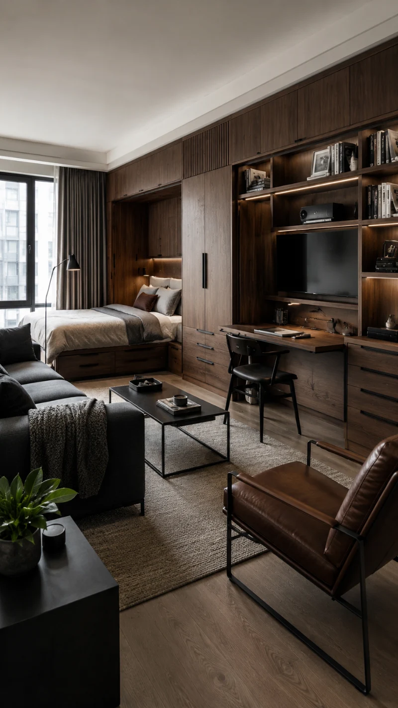
Studio is defined by a continuous walnut wood system that runs across the entire wall, combining storage, sleeping, and workspace into one seamless structure. The bed is tucked into a recessed alcove, framed in warm wood panels that make it feel private without closing it off. On the right, open shelving with soft integrated lighting displays books and objects like a curated gallery. A compact desk area sits directly below, blending into the same cabinetry so the work zone disappears when not in use. The sofa area stays darker and grounded in front, balancing the warmth of the wood with soft fabric textures.
When one continuous material runs through a studio, it turns multiple functions into one calm visual system.
The strength of this design is integration. Nothing feels added on. Every function is carved into the architecture, which removes visual noise and makes a small footprint feel intentional.
Why This Works
- Continuous Wood System: Walnut cabinetry unifies sleep, work, and storage into one visual flow.
- Recessed Bed Niche: The alcove creates privacy without needing physical walls or dividers.
- Integrated Lighting: Shelf lighting adds depth and removes the need for extra lamps.
- Hidden Workspace Logic: Desk blends into cabinetry, keeping the room visually clean when not in use.
16. Built-In Walnut Platform Bed with Hidden Storage and Integrated Studio Living Wall
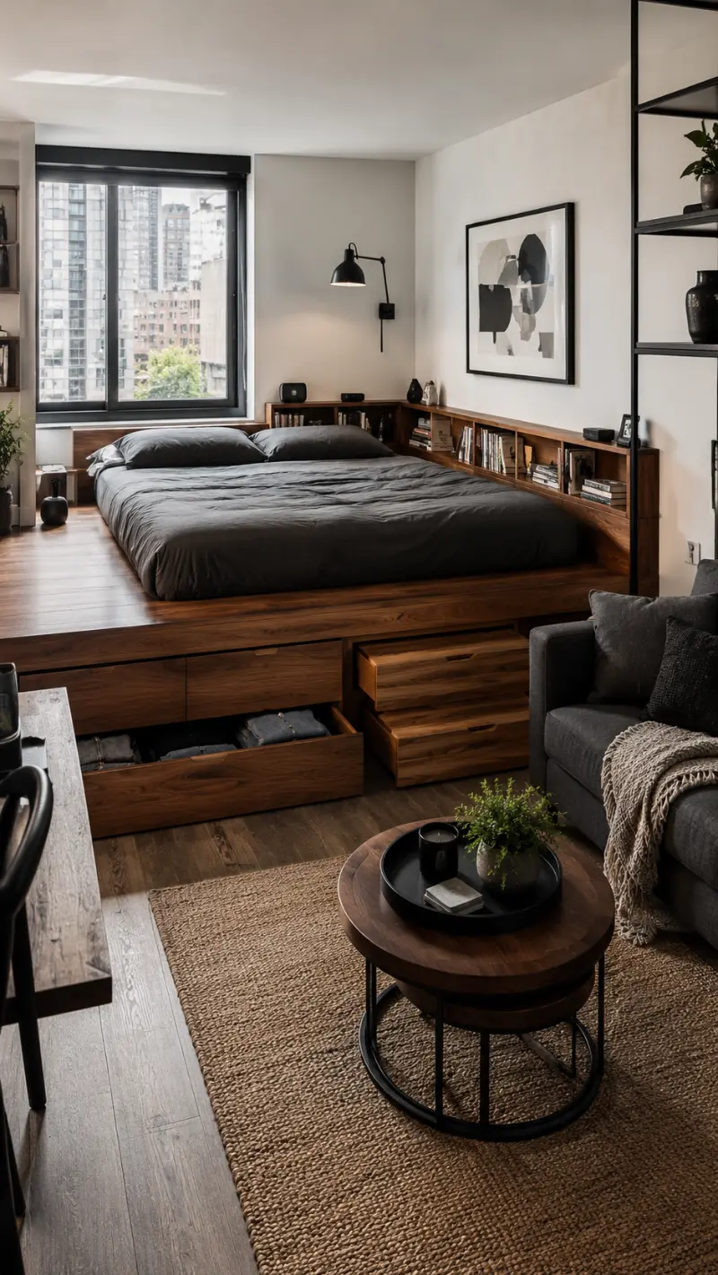
This studio is built like one continuous furniture system. A raised walnut platform holds the bed, wrapping around it with deep built-in drawers that replace the need for extra cabinets. The headboard wall extends into a full shelving unit, softly lit with warm LEDs that highlight books and small decor pieces. On the side, a compact armchair and round coffee table create a secondary lounge zone, separated just enough to feel distinct but still part of the same flow. Large windows bring in city light, balancing the darker wood tones with natural brightness.
When storage, bed, and shelving merge into one structure, a studio instantly feels larger and more intentional.
The key idea here is integration. Instead of adding furniture piece by piece, everything is embedded into one architectural system that keeps the floor clear and the layout efficient.
Why This Works
- Platform Bed Storage: Built-in drawers eliminate the need for bulky wardrobes.
- Wall-to-Wall Joinery: Continuous wood design visually stretches the room.
- Warm LED Shelving: Soft lighting adds depth without extra floor lamps.
- Zoned Seating Area: Small lounge setup creates function without breaking openness.
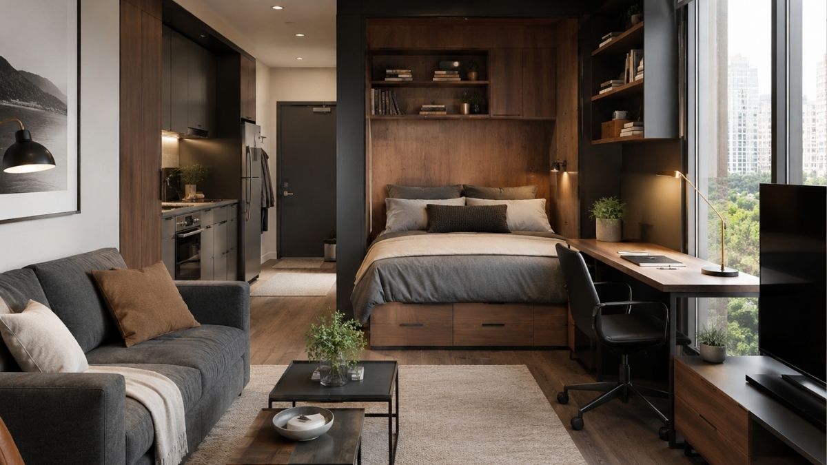
17. Glass Partition Studio with Built-In Walnut Bed Platform and Hidden Workspace Wall
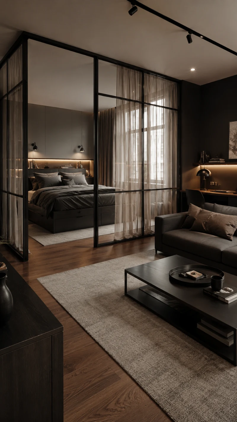
Studio uses a glass-framed partition system to separate the sleeping zone without blocking light or flow. The bed sits on a raised walnut platform with built-in storage drawers, creating a grounded sleeping area that feels both private and integrated. Behind it, a fully built-in wall runs across the room, combining shelving, desk space, and media storage in one continuous structure. Warm LED lighting inside the shelving adds depth against the darker wood tones, while soft curtains filter daylight from the large window, keeping the atmosphere calm and balanced. A compact sofa and coffee table in the foreground complete the living zone without competing with the architectural elements.
Transparent partitions are the secret to dividing a studio without losing openness or natural light.
The strength of this design lies in layering. Glass defines zones visually, wood adds structure and warmth, and soft textiles keep everything livable and grounded.
Why This Works
- Glass Zoning: Clear partitions divide space while preserving light and visual connection.
- Built-In Storage Wall: One continuous system replaces multiple furniture pieces and reduces clutter.
- Warm Wood Base: Walnut tones bring depth and contrast against soft neutral surroundings.
- Layered Lighting: Integrated LEDs create mood and highlight shelving without extra lamps.