
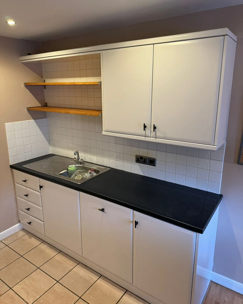
Rental kitchens often feel stuck between someone else’s choices and your daily routine. Morning light hits worn cabinets, and the counters carry the memory of old meals. Still, the space can feel warm with the right small changes.
This approach focuses on changes you can remove in minutes. Peel-and-stick tiles, removable wallpaper, and simple hardware swaps let you shift the mood without damage. Every update stays temporary but still feels fresh while you live there.
Next, you will see simple ideas that refresh cabinets, walls, and corners in a single day. Each one is renter-safe and easy to undo when you move out.
Lighting
Warm under-cabinet glow adds depth and makes vinyl finishes feel richer.
Texture
Matte vinyl reduces glare and creates a soft modern surface finish.
Color Anchor
Stick to one grounding tone like warm oak or soft gray for balance.
Renter Tip
Use peelable handles that install without drilling and remove cleanly.
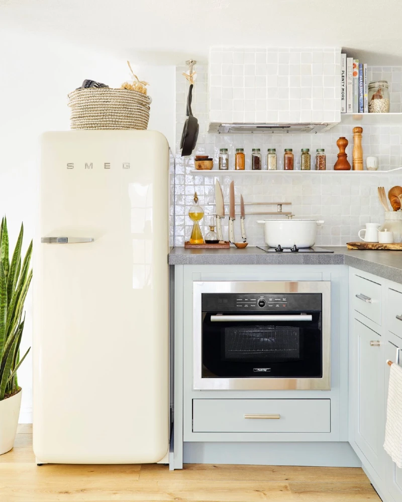
1. Matte White Cabinets with Open Wooden Shelves and Black Countertop Contrast
Soft white cabinets line the wall, paired with a matte black countertop that runs clean and uninterrupted beneath them. Open wooden shelves sit on the left side, adding warm contrast against the square white tile backsplash. The space feels structured and minimal, with simple black handles tying the look together.
Clean contrast between white, black, and wood keeps a rental kitchen from feeling flat or forgotten.
The strongest move here is the balance of tones. Light cabinets reflect brightness, while the dark counter anchors the whole wall. Open shelves break the closed cabinet block and give breathing space for styling everyday items.
2. Mint Green Cabinets with Pink Accent Wall and Open Storage Styling
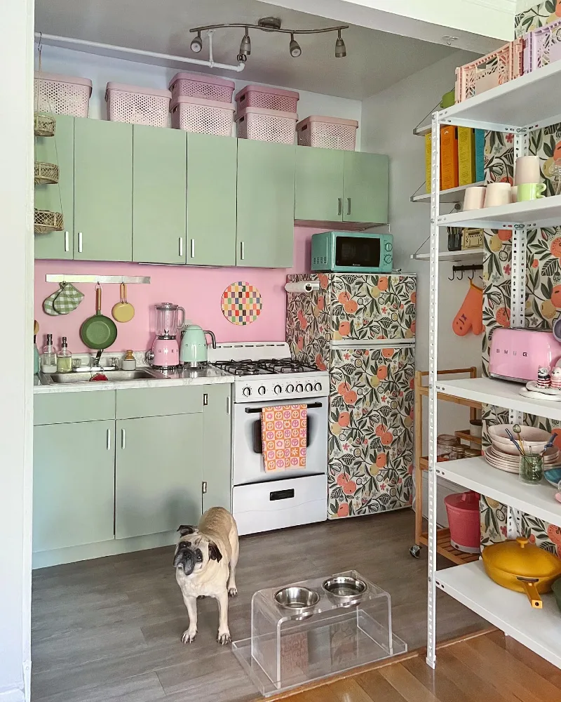
Soft mint green cabinets run across the wall, paired with a warm pink backsplash that instantly changes the mood of the kitchen. Patterned coverings on the fridge and playful pastel storage bins on top of the cabinets add layers of personality.
Color blocking with soft pastels turns a plain rental kitchen into a space that feels designed, not assigned.
What makes this setup work is how the colors stay controlled even while the styling feels expressive. The green and pink stay in balance, while the patterned elements act as accents rather than noise. Even the storage on top of cabinets becomes part of the design instead of clutter.
To recreate this, stick to two main tones and repeat them across surfaces like walls, cabinets, and accessories. Then let small accents carry personality without overwhelming the base palette.
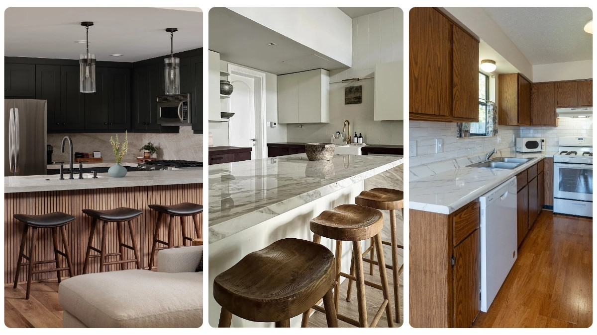
3. Matte Black Cabinets with Wood Slat Island and Glass Pendant Lighting
Deep matte black cabinets wrap the kitchen in a calm, grounded tone. A light stone countertop softens the darkness, while three glass pendant lights hang above the island like clear sculptural tubes. The front of the island uses vertical wood slats, bringing warmth against the cool surfaces.
Dark cabinetry works best when it’s balanced with natural wood and soft stone textures.
This kitchen feels structured but not heavy because every hard surface has a softer counterpoint. The wood bar stools repeat the island’s vertical rhythm, pulling the whole layout into alignment. Even the lighting stays airy, letting the darker palette breathe instead of closing in.
Why This Works
- Matte Surfaces: They absorb light and keep the black cabinetry from feeling harsh.
- Vertical Wood Slats: They break up solid planes and add natural warmth at eye level.
- Glass Pendants: They maintain openness while still defining the island zone.
4. Marble Waterfall Island with Wood Stools and Soft Neutral Cabinets
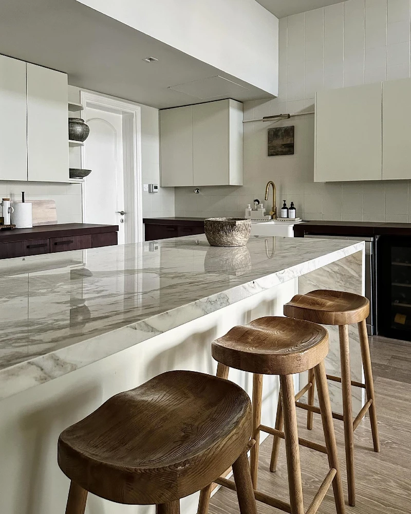
A wide marble island stretches through the kitchen with soft gray veining running across the surface. Three sculpted wooden stools sit in a row, each with thick organic curves that contrast the stone. Behind it, pale beige cabinets and a subtle tile wall keep everything calm and continuous.
Natural wood against polished marble creates a quiet balance that feels expensive without trying hard.
This space works because nothing is competing for attention. The island acts as the main visual anchor, while the stools add warmth at eye level. Even the muted cabinetry supports the marble instead of fighting it.
Small details carry the weight here, especially texture contrast between stone, wood, and matte finishes. That mix keeps a neutral kitchen from feeling empty or cold.
5. Warm Wood Cabinets with Marble Look Counter and Classic Rental Layout
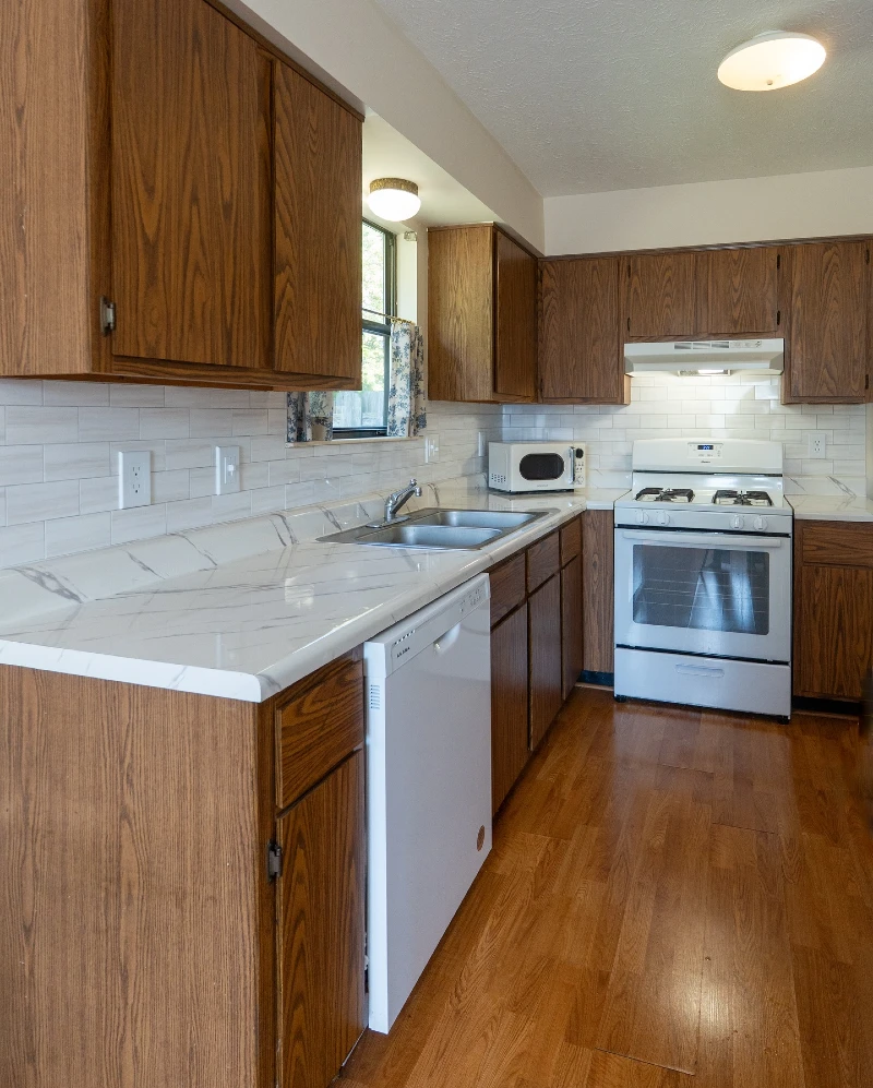
Golden wood cabinets line the kitchen and give the space a heavy, dated feel before any styling changes. A white marble-look countertop runs along the wall, paired with light tile backsplash that reflects the overhead lighting. Basic appliances sit in place, including a white stove, dishwasher panel, and compact microwave in the corner.
This kind of kitchen feels better instantly when you shift attention away from the wood tone and toward lighter surface balance.
The main challenge here is visual weight from the cabinets. Once you introduce lighter accents on counters and walls, the wood stops dominating the room. Small styling choices can redirect focus toward cleaner lines and brighter surfaces.
Quick Styling Tips
- Budget version: Use peel and stick marble film on counters to soften heavy wood contrast without replacement.
- Renter tip: Add removable shelf liners or contact paper inside visible cabinet zones for a lighter interior feel.
- Pro move: Replace harsh overhead bulbs with warm diffused lighting to reduce the orange tone of the wood.
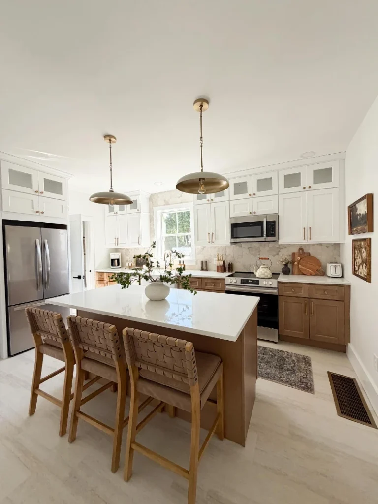
6. Bright White Shaker Cabinets with Subway Tile and Matte Black Faucet
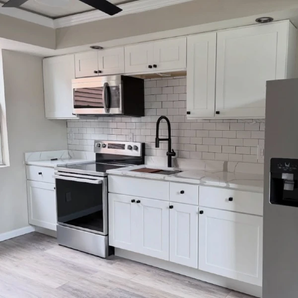
Clean white shaker cabinets line the wall, paired with a glossy subway tile backsplash that reflects natural light from the window. Stainless steel appliances sit neatly along the run, while a matte black faucet creates a sharp contrast at the sink. The space feels open, bright, and tightly organized.
A crisp black-and-white base makes even a basic rental kitchen feel fresh and structured.
This layout works because every element supports brightness and clarity. The white cabinets expand the visual space, while the subway tile adds subtle texture without cluttering the walls. The black faucet becomes a small focal point that prevents the design from feeling too flat.
Keeping finishes consistent across hardware and appliances helps the room stay cohesive. Even in a rental, this kind of controlled contrast gives the kitchen a more intentional look.
7. Warm White Cabinets with Woven Basket Storage and Fridge Memory Wall
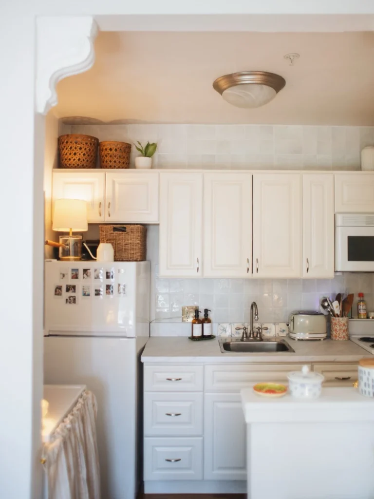
Soft white cabinets stretch across the wall with a gentle glow from warm lighting. Woven baskets sit above the upper cabinets, adding texture against the smooth tile backsplash. A small lamp placed on top of the fridge creates an unexpected cozy corner, while photos on the fridge turn it into a lived-in focal point.
Small personal details like baskets, photos, and warm lighting make a rental kitchen feel emotionally lived-in, not temporary.
This space works because it mixes storage with storytelling. Nothing feels staged or sterile, even though the layout is simple and compact. The lamp softens the appliance-heavy corner and pulls attention upward, which helps the kitchen feel taller and warmer.
Layering soft materials against hard surfaces keeps the room from feeling flat. Even basic white cabinets gain character when paired with woven textures and personal objects.
8. White Shaker Cabinets with Warm Wood Island and Woven Counter Stools
Bright white shaker cabinets wrap around the kitchen, keeping the perimeter clean and airy. A large island finished in warm wood tones anchors the center, topped with a smooth white surface that reflects soft daylight. Woven back stools line the island, adding texture that feels handmade and grounded.
Blending crisp white cabinetry with warm wood instantly creates a balanced kitchen that feels lived-in, not showroom-stiff.
This layout works because it separates functions through materials. The perimeter stays light and functional, while the island becomes the social center with stronger visual weight. Even the pendant lighting above helps define zones without closing the space.
The woven stools are the quiet detail that ties everything together. They soften the clean lines and bring a natural rhythm that makes the whole kitchen feel approachable.
9. Taupe Shaker Cabinets with Copper Accents and Warm Wood Counter
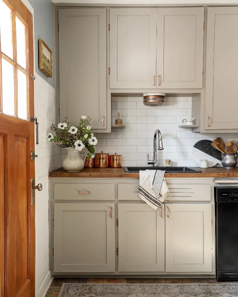
Soft taupe shaker cabinets fill the small kitchen wall, paired with a warm wood countertop that adds natural depth. A black sink sits centered under white subway tile, while copper pots and containers bring a gentle metallic glow to the space. A wooden door on the left adds even more warmth, tying into the earthy palette.
Warm neutrals with copper accents create a grounded kitchen that feels calm but not plain.
This kitchen works because every tone stays in the same warm family. The taupe cabinets avoid harsh contrast, while copper details introduce just enough shine to catch the light. Even the wood surface feels connected to the door, so nothing feels visually disconnected.
Quick Styling Tips
- Budget version: Swap hardware for copper-toned handles to instantly lift neutral cabinets.
- Renter tip: Use removable contact paper in warm wood tones to refresh worn counters.
- Pro move: Add one metallic cluster (pots or canisters) instead of scattering small decor items.
10. Mirror Shelf Kitchen with Copper Marble Counter and Warm Wood Ceiling Accents
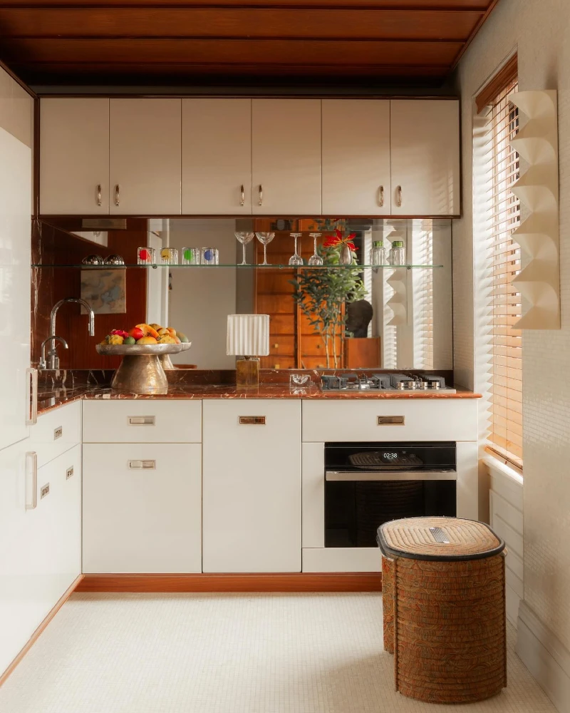
White lower cabinets sit beneath a rich marble counter with soft brown veining that reflects the warm light. A mirrored backsplash runs across the wall, holding a thin glass shelf lined with glasses and small colored accents. Above, warm wood ceiling panels add depth, while copper tones on the counter bring a subtle glow.
Reflective surfaces instantly double light and make a compact rental kitchen feel wider and more layered.
The mirror creates a visual extension of the room, bouncing light back into the space instead of letting the wall feel flat. Copper and wood elements sit in contrast, adding warmth so the reflective surfaces don’t feel cold. Even small styling pieces like fruit bowls and glassware become part of the design story when reflected.
Quick Styling Tips
- Budget version: Use stick-on mirror panels as a backsplash upgrade for instant depth.
- Renter tip: Style a thin floating shelf with lightweight glass items instead of drilling new storage.
- Pro move: Add one warm metallic element (like copper or brass) to stop mirrors from feeling too sterile.
11. White Cottage Cabinets with Dark Wood Counter and Window Herb Nook
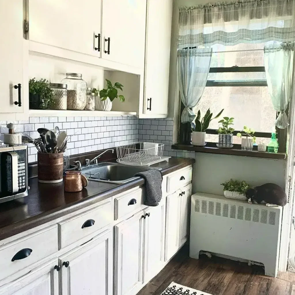
Soft white cabinets run along the wall, paired with a deep brown wooden countertop that adds strong contrast. A subway tile backsplash keeps the surface clean and structured, while open cubbies hold jars, plants, and everyday kitchen items. Natural light comes through the window on the right, where small potted herbs sit on the sill.
Even the smallest window ledge becomes a living design moment when you treat it like part of the kitchen styling.
This kitchen feels lived-in because storage is mixed with soft personal details. Glass jars, greenery, and simple containers break the repetition of closed cabinets. The dark counter grounds the space, while the white cabinetry keeps everything bright and open.
What stands out most is how utility blends into comfort. Even the radiator area becomes a resting spot for plants, turning a functional corner into part of the overall atmosphere.
12. Red Gingham Covered Kitchen with Patterned Pantry Wall and Open Rustic Shelving
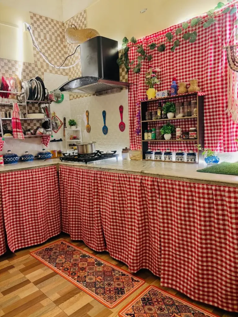
Bold red gingham fabric wraps the lower cabinets and parts of the wall, instantly turning the kitchen into a high-energy, vintage-inspired space. Open shelving on the right holds jars, spices, and small decor pieces, all layered against the patterned backdrop.
Using one dominant pattern across multiple surfaces can completely reshape a rental kitchen without changing a single cabinet.
This design works because repetition creates structure even when the details feel playful. The gingham pattern connects walls, counters, and storage visually, so nothing feels random. Open shelves break up the density of the print and keep the space functional for daily use.
Why This Works
- Pattern Continuity: Repeating gingham across surfaces makes the kitchen feel designed rather than decorated in pieces.
- Open Shelving Balance: Exposed storage prevents the strong pattern from overwhelming the entire room.
- Warm Material Mix: Wood floors and natural accents soften the intensity of the red check fabric.
13. Soft Mint Cabinets with Backlit Glass Display Shelves and Patterned Tile Backsplash
Muted mint cabinetry runs across the kitchen, paired with black countertops that add a strong grounding line. Warm backlit glass cabinets glow on both sides of the cooking area, turning everyday storage into a display feature. A patterned backsplash sits behind the stove, adding subtle visual rhythm without overpowering the layout.
Warm hidden lighting inside cabinets turns storage into atmosphere instead of clutter.
This kitchen works because light is used as a design layer, not just function. The soft glow behind glass shelves highlights jars, cups, and small decor pieces, making them feel intentional. Even the mint tone stays calm because darker counters and appliances keep the contrast balanced.
Small decorative moments are carefully placed rather than scattered. That controlled styling keeps the space feeling organized while still visually rich.
14. Mint Green Cabinets with Pink Geometric Tile Backsplash and Black Counter Contrast
Soft mint cabinets stretch across the wall, paired with a patterned pink-and-cream geometric backsplash that immediately draws attention. A black countertop grounds the lower half of the kitchen, while matte black handles and hardware keep the palette consistent.
When color and pattern are repeated with control, even bold combinations feel calm and intentional.
This kitchen stands out because it balances softness with structure. The mint cabinets keep the base light, while the pink tile introduces rhythm through repeating shapes. Black accents stop the palette from drifting into pastel overload, giving the whole space a clearer visual anchor.
Why This Works
- Color Pairing: Mint and blush tones create contrast that feels playful but still coordinated.
- Pattern Control: The backsplash pattern is bold, but limited placement keeps it from overwhelming the space.
- Dark Anchors: Black countertop and handles add structure and prevent the soft colors from floating visually.
15. Warm Minimal Kitchen with Wood Island, Soft Neutrals, and Open Shelf Styling
Soft cream cabinetry wraps the walls, paired with warm wood tones that carry through the central island and flooring. Light pendant lamps hang above, casting a gentle glow across the space. Open wooden shelves on the walls hold simple ceramics, glassware, and small decor pieces arranged in a clean, breathable way.
A neutral kitchen feels most inviting when wood tones are repeated across multiple surfaces instead of isolated in one spot.
This layout works because everything feels connected through tone and material. The island becomes the natural focal point, while soft lighting and minimal styling keep the room calm rather than empty. Even the shelf styling stays restrained, letting each object feel intentional without cluttering the view.
The result is a rental-friendly kitchen that relies on warmth, texture, and repetition instead of bold color changes.
16. Retro Cream Fridge with Soft Blue Cabinets and Open Spice Shelving
A tall cream retro-style fridge anchors the left side of the kitchen, its rounded edges softening the overall layout. Behind it, pale blue cabinetry blends into a light tile backsplash, while open shelves display neatly lined spices, books, and small kitchen tools.
A single statement appliance can become the focal point that sets the entire color mood of a rental kitchen.
This space works because the fridge isn’t hidden—it leads the design. The soft blue cabinetry supports it instead of competing, and the open shelving adds rhythm without closing off the wall. Even the spice jars and wood tools feel intentional, like part of a quiet daily routine.
Keeping the palette soft allows every object to feel visible but not busy. It’s a controlled mix of nostalgia and modern function that suits small rental kitchens especially well.
17. Colonial White Kitchen with Wood Island, Brass Details, and Blue Plate Wall Accents
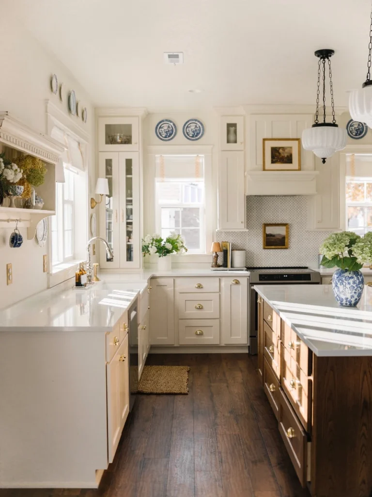
Bright cream cabinetry wraps the space, paired with warm wood tones on the island and lower drawers. Brass hardware and vintage-style pendant lights add a soft golden shine across the room.
Repeating warm metals like brass across lighting, hardware, and decor keeps a traditional kitchen feeling unified instead of busy.
This kitchen works because it blends structure with storytelling. The white cabinetry creates a calm base, while wood and brass introduce warmth and depth. The plate wall and framed art give personality without disrupting the clean architectural lines. Everything feels placed with intention, not filled for decoration.
The mix of natural light, soft neutrals, and traditional accents makes the space feel timeless while still approachable in a rental setting.
18. Taupe Cabinets with Checkerboard Floor and Scalloped Wood Range Hood Accent
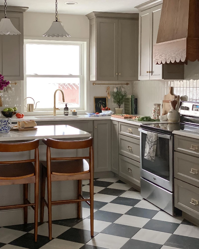
Soft taupe cabinetry wraps the kitchen in a calm, muted tone, paired with a bold black-and-white checkerboard floor that instantly adds movement. A sculpted wood range hood with scalloped detailing becomes the focal point above the stove, while brass hardware and warm pendant lights bring a gentle glow across the space.
A strong floor pattern can anchor an entire rental kitchen, even when the cabinetry stays neutral.
This space works because contrast is used at ground level instead of the walls. The checkerboard floor creates energy without cluttering the sightline, while the soft cabinets keep everything visually calm. The range hood acts like a crafted centerpiece, pulling attention upward and breaking the symmetry of the layout.
Why This Works
- Floor Pattern Anchor: The checkerboard design grounds the kitchen and adds instant visual rhythm.
- Sculptural Hood Detail: The scalloped wood hood introduces craftsmanship that softens the modern layout.
- Warm Metal Accents: Brass handles and lighting unify the neutral palette with subtle warmth.
19. Soft Grey Cabinets with Brass Hardware and Open Shelf Gallery Styling
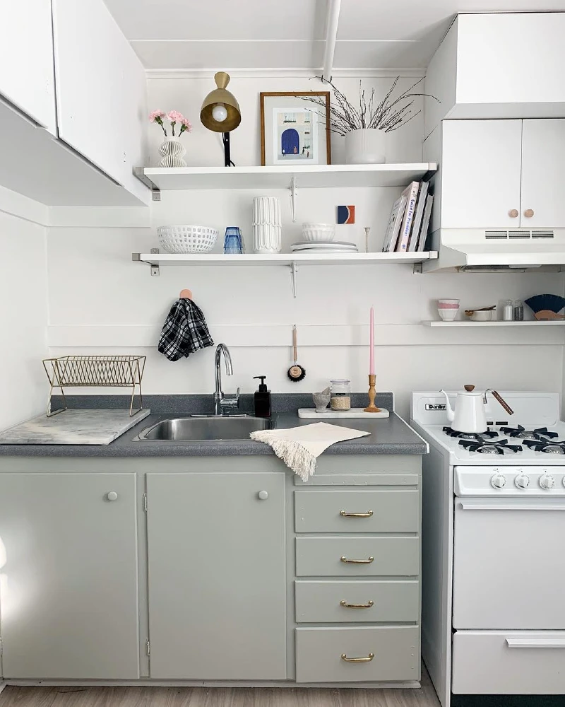
Muted grey-green cabinets create a calm base in this compact kitchen, paired with a dark countertop that adds subtle contrast. Open floating shelves replace upper cabinets, styled with ceramics, glassware, books, and small art pieces that turn storage into display.
Open shelving turns everyday kitchen items into a curated visual story when everything is grouped by tone and shape.
This space works because it blends function with light styling instead of hiding everything behind doors. The shelves are not overcrowded, so each object has breathing room. Even small accents like framed art, folded textiles, and simple bowls contribute to a layered but controlled look.
What makes this rental-friendly is flexibility. Nothing here is permanent, yet the kitchen still feels designed and personal through thoughtful placement and repetition of materials.
20. Olive Green Cabinets with Checkerboard Floor and Brass Range Oven Island Contrast
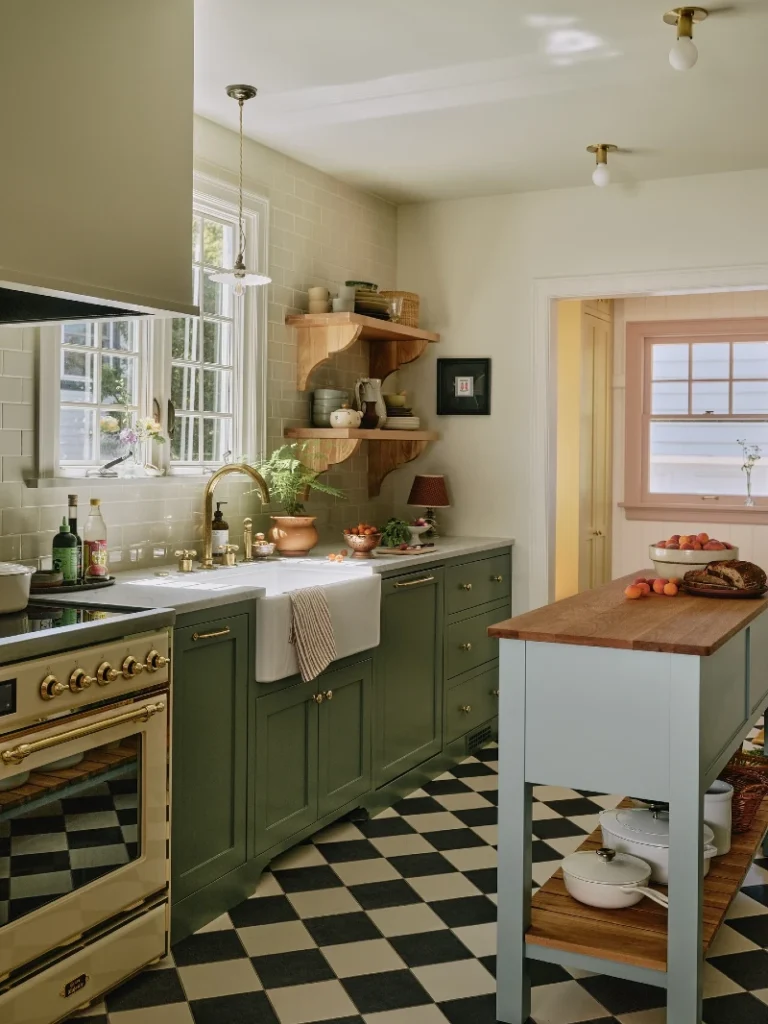
Deep olive green cabinets line the wall, paired with a bold black and white checkerboard floor that immediately sets a strong visual rhythm. A brass-accented oven brings warmth and shine into the cooking zone, while a central island with a wood top and soft painted base creates a secondary workspace.
Strong floor pattern combined with rich cabinetry gives a rental kitchen instant structure and character without needing full renovation.
This kitchen works because every layer carries its own visual role. The cabinets stay grounded and earthy, while the floor adds movement underfoot. Brass details soften the darker tones, and the island introduces a lighter, more relaxed focal point for gathering and prep.
Quick Styling Tips
- Budget version: Use peel style checkerboard vinyl flooring to recreate the same visual rhythm without replacing tiles.
- Renter tip: Add removable wood contact surfaces on an island or cart to bring warmth without altering cabinetry.
- Pro move: Repeat one metal finish, like brass, across stove, handles, and lighting to keep the space cohesive.
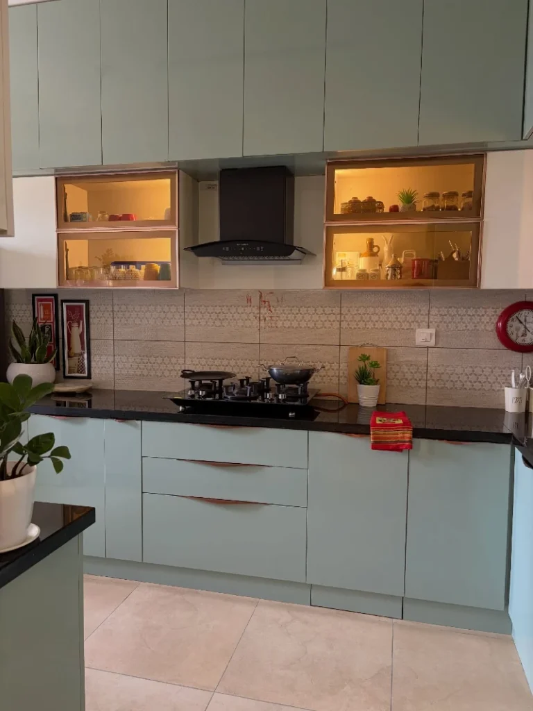
21. Soft Sage Cabinets with Brass Hardware and Stainless Stove Contrast
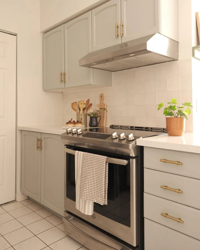
Muted sage-toned cabinets create a calm base, paired with warm brass handles that add a soft metallic lift. A stainless steel stove sits at the center, framed by a simple light backsplash and clean white countertop surfaces.
Even the smallest mix of brass, sage, and stainless steel creates depth when everything stays in a tight, controlled palette.
This kitchen works because the color story stays quiet but layered. The sage cabinetry softens the strong lines of the appliances, while brass accents warm up the cooler metal surfaces. Nothing feels overstyled, yet every element feels intentional and placed with care.
The result is a rental-friendly kitchen that feels fresh, functional, and easy to maintain while still carrying visual character.