
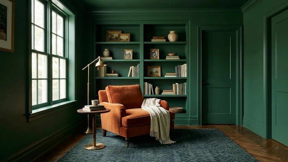
Color drenching is not just a passing phase. It is one of the most effective 2026 interior design trends for making a space look completely custom and expensive. But there is a very fine line between a cozy retreat and a dark cave.
You need a clear plan before you open a single can of paint. You will learn exactly how to color drench a room the right way. We will look at designer rules for choosing the right paint finish and avoiding the dreaded white ceiling disaster.
It feels terrifying to paint the ceiling dark, but trust the process. You are about to turn your basic room into a high end sanctuary.
What is Color Drenching? (And Why It Works)
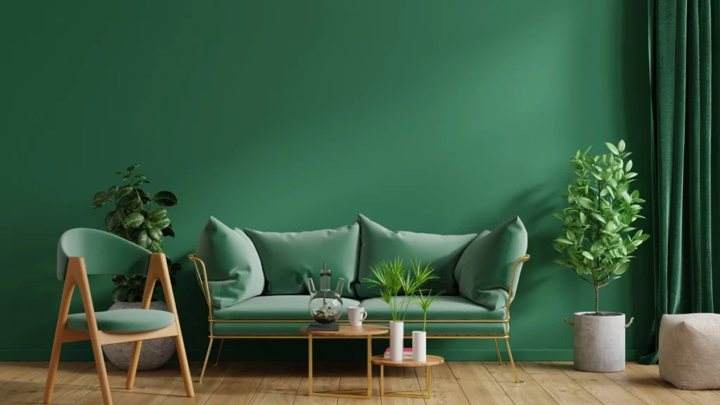
The easiest way to ruin a space is to misunderstand what this technique actually does. Color drenching means painting the walls, ceiling, trim, baseboards, and even doors in a single hue.
You can also use a tightly related color family. Monochromatic room painting removes visual stop signs. High contrast white trim acts as a stop sign for your eyes. Remove the white trim, and the room instantly expands to read as one continuous volume.
This style is peaking right now because people want comfort at home. Sophie Salata from Vinterior notes a massive 2026 shift toward “found luxury” and highly tactile textures.
We are moving away from cool grays and moving toward warm and earthy spaces that actually feel lived in. The goal is to create a room that wraps around you like a blanket.
Interior expert Todd Harmon explains this perfectly. He says, “A color drenched room doesn’t feel dramatic to me. It feels resolved. Like the space finally stopped arguing with itself.”
The takeaway: Do not fear the dark paint. When you paint everything the same shade, the edges soften and the room embraces you.
5 Color Drenching Mistakes You Must Avoid

The quickest way to ruin a color drenched room is by treating it like a standard paint job. You have to change your entire approach. Avoiding common color drenching mistakes will save you time and money. Here are the five exact errors to avoid.
- Leaving the ceiling white. This is the biggest error you can make. A white ceiling acts like a lid on a box and completely breaks the illusion of endless space.
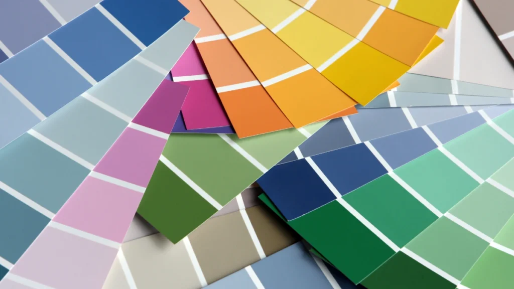
- Using bright neon colors. Highly saturated colors will give you a headache. You want muted and complex tones, like a dusty sage instead of a bright kelly green.
- Forgetting to upgrade your lighting. Bad lighting creates a literal cave effect. Designers strongly recommend warm light bulbs specifically in the 2700K to 3000K range to keep dark rooms from feeling flat or dead.
- Painting everything in high gloss. Shiny walls show every single flaw. Never use high gloss on your walls unless you want your living room to feel like a funhouse mirror.
- Ignoring texture in your furniture. A single color room needs texture to survive. If your walls are flat, your furniture needs to be highly textured.
The takeaway: A successful room relies on warm lighting and total commitment. Do not leave that ceiling white.
How to Choose the Right Paint Finish (The Secret Sauce)
Once you have committed to painting the ceiling, your next hurdle is choosing the right finish. In a standard room, you create contrast with different colors.
In a single color room, contrast comes entirely from the paint sheen. This is the secret to learning how to color drench a room like a pro.
The Sheen Matrix
Strategic light-interaction mapping
Soft Wall Diffusion
For the walls and ceiling: Use a matte or eggshell finish to seamlessly absorb ambient glare and generate a deep, soft velvety look.
Reflective Frameworks
For the trim and doors: Use a premium satin or semi gloss finish to maximize surface durability and cast a subtle architectural reflection.
The Modern Alternative
Contemporary layouts can unify envelopes by applying an absolute, light-devouring “dead flat” finish across every single surface simultaneously.
Brands like Farrow & Ball offer a brilliant “Dead Flat” finish. This is a massive time saver for DIY painters. It prevents the need to carefully cut in around your trim with different sheen levels.
The takeaway: Mix your sheens to create depth, or go completely flat for a modern look. Just never put shiny paint on a large flat wall.
The 70 20 10 Rule for Monochromatic Rooms

Choosing your finish is important, but balancing your color tones is where the magic happens. You might think monochromatic room painting means using one exact paint chip for everything.
You can actually use the classic 70 20 10 design rule to add beautiful layers.
Here is exactly how to apply this rule to your space:
The Proportion Rule
Mathematical weights of spatial styling
The Dominant Anchor
70 Percent serves as your main chosen color envelope, mapping comprehensively across your structural walls and your ceiling.
The Secondary Support
20 Percent introduces a slightly lighter or darker version of the main hue to ground your peripheral architectural trim or built-in cabinets.
The Focal Interjection
10 Percent commands absolute attention as your highly contrasting accent color, woven in through curated art, textiles, or brass hardware.
Interior designer Bethany Adams points to the massive 2026 trend of “book drenching.” This means painting your library shelving to match the room’s color family. It is the perfect place to use this 20 percent tonal variation.
The takeaway: Give your eyes a place to rest. That 10 percent of contrasting color keeps the room from feeling completely overwhelming.
Step by Step: How to Color Drench Your Space

The best paint job in the world will fail if you skip the preparation. Ninety percent of the work happens before you even open the paint can. If you want to know how to color drench a room flawlessly, follow this exact sequence.
- Test large swatches. Buy large peel and stick paint samples. They must be at least 2 feet by 2 feet so you can accurately gauge light absorption. Look at them at night because drenched rooms look their absolute best under artificial light.
- Prepare the walls heavily. Clean your baseboards and walls with sugar soap. Transitioning a light room to a dark drench requires a tinted primer plus a minimum of three coats of paint for true depth.
- Paint the ceiling first. Gravity is real. Doing the ceiling first guarantees you will not drip wet paint on your beautifully finished walls.
- Layer your textures. Once the paint dries, bring in heavy textures. Use linen fabrics, warm woods, brass hardware, and thick boucle blankets.
If you need color ideas, look at the top 2026 interior design trends. Earthy reds like burgundy and terracotta are huge.
Warm browns like chocolate and dusty sage greens are also perfect. Farrow & Ball colors like Sulking Room Pink or Oval Room Blue are excellent choices.
The takeaway: Do the boring prep work. Wash the walls and tint the primer, and your final result will look incredible.
Quick Guide: Where to Put Each Paint Finish
Use this simple chart when you buy your paint. It shows you exactly which finish belongs on which surface.
| Room Surface | Best Paint Finish | Why It Works |
| Walls and Ceilings | Matte or Eggshell | Absorbs light and hides wall flaws. |
| Trim and Baseboards | Satin | Adds soft contrast to flat walls. |
| Interior Doors | Satin | Makes the door easy to wipe clean. |
| Wood Shelves | Dead Flat or Satin | Protects the wood from heavy objects. |
Conclusion
Color drenching succeeds when you take control of the details. You have to upgrade your lighting to warm bulbs. You must vary your paint sheens to create subtle contrast.
Most importantly, you have to commit to painting the ceiling. Half measures will only make the room look unfinished.