
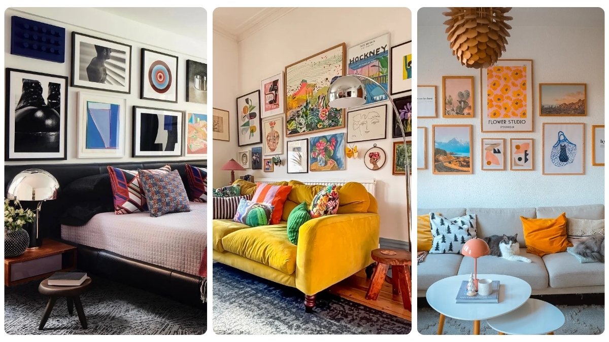
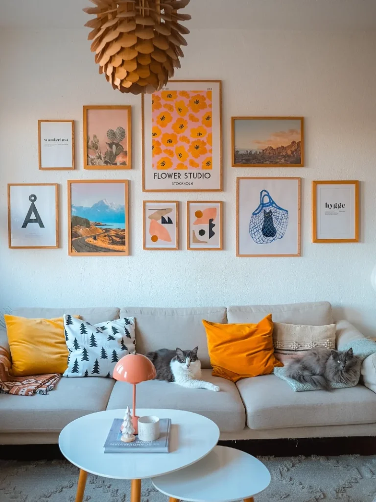
A gallery wall makes an apartment feel lived in fast. Frames add color, rhythm, and little flashes of memory across a plain rental wall. Soft art, family photos, and warm lamp light can make even white paint feel personal.
The best part is how flexible it can be. You do not need nails, heavy anchors, or a scary talk with your landlord. Peel-and-stick strips, ledges, washi tape, and lightweight frames all let you play without damage.
Inside, you will find renter-friendly gallery wall ideas that feel stylish, warm, and easy to try. Some are bold. Others feel calm, airy, and collected over time.
Renter Tip
Use removable strips matched to frame weight for safe, damage-free hanging.
Color Anchor
Repeat one shade across multiple pieces to keep the wall visually connected.
Texture Mix
Combine paper, canvas, and woven pieces for a softer, more layered feel.
Focal Point
Offset the largest frame slightly to create a more natural visual flow.
1. Striped Accent Wall Gallery Above Velvet Sofa with Mustard Cushions
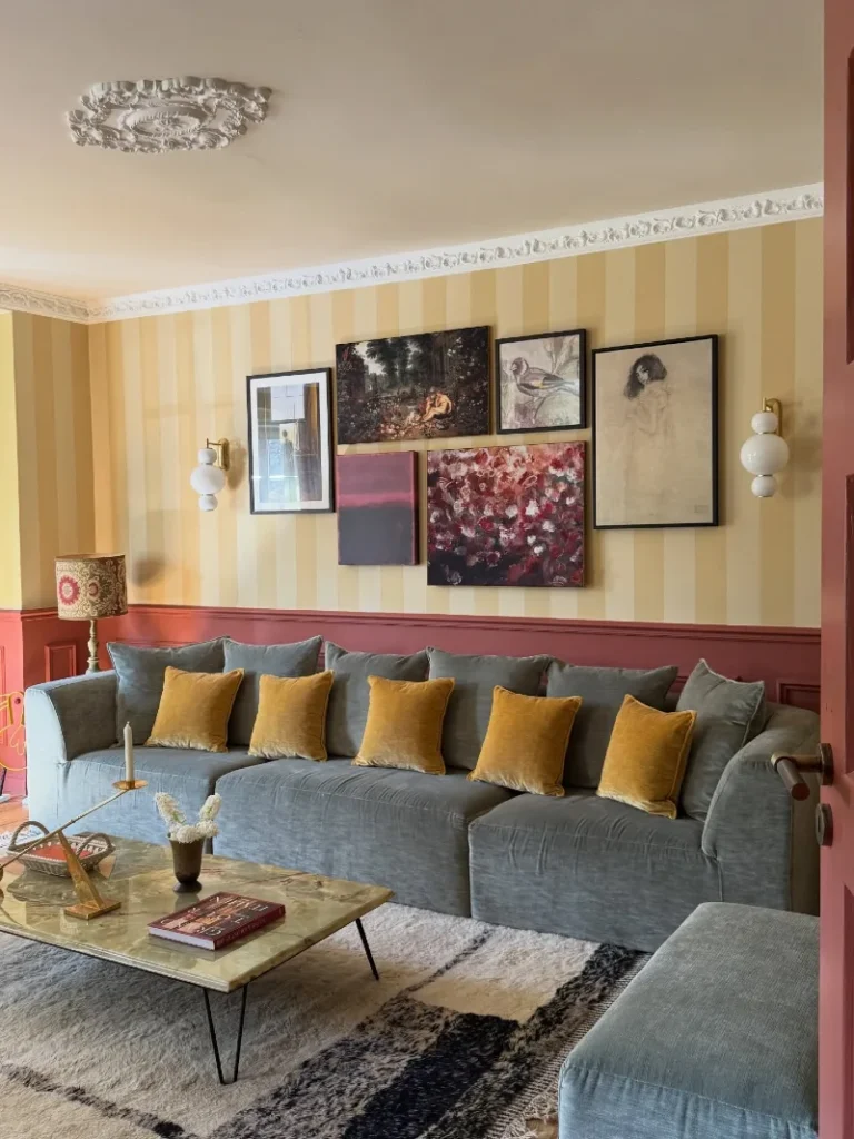
Soft yellow vertical stripes wrap the wall and set a warm backdrop for an eclectic gallery arrangement. A grey sofa runs along the base, dressed with mustard cushions that add a grounded contrast. Framed artwork in mixed sizes sits in a loose grid, balanced between dark botanical tones, sketches, and abstract florals.
A layered gallery wall feels richer when color, light, and frame spacing work together instead of competing.
The mix of frame sizes keeps the wall from feeling rigid while still holding structure. Warm lighting from the sconces pulls attention upward and makes the artwork feel intentional at night.
- Lighting: Wall sconces soften shadows and highlight artwork without harsh overhead glare.
- Color Anchor: Mustard cushions repeat warm tones that echo the wall’s golden stripes.
- Layering: Mixing figurative and abstract pieces builds depth without visual clutter.
- Renter Tip: Use removable hooks and lightweight frames to protect paint while keeping alignment flexible.
2. Layered Black Frame Gallery Above Wood Dresser with Mixed Art and Sculpture Accents
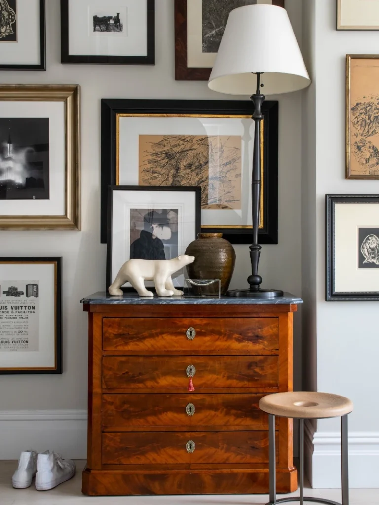
A dense gallery wall fills the space above a warm wood dresser, packed with black, gold, and wood-toned frames. The artwork mixes sketches, monochrome photography, and soft abstract drawings, creating a collected studio feel. A tall floor lamp rises beside the dresser, its white shade adding a calm vertical line.
Tight spacing between frames turns even mixed artwork into one cohesive visual story.
The arrangement leans into contrast without feeling chaotic. Dark frames anchor the eye while lighter mats and sketches keep the wall breathable.
- Focal Point: The largest central frame sets the visual anchor and guides the layout around it.
- Texture: Wood grain, ceramics, and paper art add depth beyond flat frames.
- Lighting: The floor lamp softens the wall and prevents the gallery from feeling heavy.
- Layering: Overlapping frame sizes builds rhythm without needing perfect symmetry.
3. Mid-Century Orange Gallery Wall with Warm Minimal Frames Above Neutral Sofa
A clean white wall becomes a soft gallery grid of warm-toned wooden frames, arranged in balanced spacing above a neutral sofa. The artwork leans into earthy oranges, soft landscapes, and simple abstract shapes that echo the cushions below.
Repeating warm tones across art and textiles is what turns a simple grid into a cohesive story.
The layout avoids clutter by keeping frame spacing even, which lets each piece breathe. Even with different subjects, the shared wood frames pull everything into one calm visual rhythm.
Why This Works
- Frame Consistency: Matching wood frames unify different art styles into one system.
- Color Harmony: Orange accents in cushions echo the artwork for instant cohesion.
- Vertical Balance: The central larger print anchors the grid and stabilizes the wall.
- Soft Contrast: Neutral sofa prevents the warm palette from feeling visually heavy.
4. Eclectic Salon Wall Above Doorway with Layered Vintage Frames and Indoor Plants
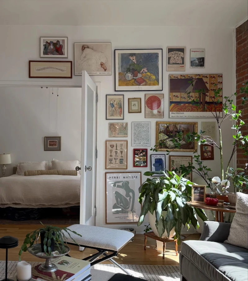
A full gallery wall stretches across the white surface above an open doorway, filled with tightly packed vintage-style frames. The artwork ranges from figurative sketches to colorful prints and old-style posters, all arranged in a dense salon layout.
A salon-style gallery works best when density replaces symmetry and the eye is guided by rhythm, not order.
The mix of frame sizes and finishes creates a collected feel, almost like the wall evolved over time. Natural light falling across the frames keeps the heavy arrangement from feeling closed in.
- Layering: Tight spacing lets even unrelated artwork feel like one intentional collection.
- Focal Point: Larger central pieces help anchor a busy wall without strict symmetry.
- Texture: Plants introduce softness that balances the hard lines of frames.
- Color Anchor: Repeating muted earth tones keeps visual noise under control.
5. Bold Abstract Gallery Wall with Mixed Frames Above Mid-Century Media Console
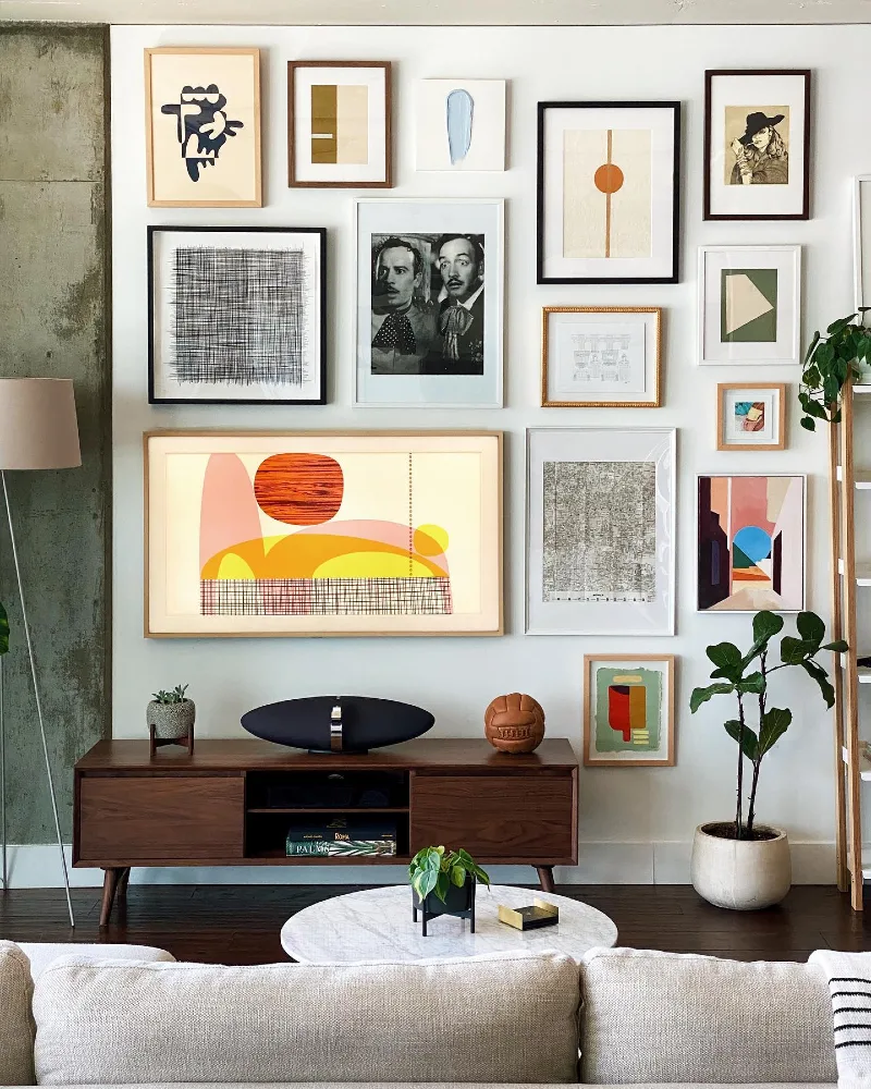
A crisp white wall becomes a structured collage of abstract prints, sketches, and photography arranged in a loose but balanced grid. Frames in black, white, wood, and brass create contrast while still feeling visually controlled.
A strong gallery wall starts with one dominant piece that quietly sets the rhythm for everything around it.
The mix of geometric art and figurative prints gives the wall energy without feeling chaotic. Even with different frame styles, alignment and spacing keep the whole arrangement grounded and intentional.
- Focal Point: The oversized abstract print anchors the wall and prevents visual scatter.
- Color Anchor: Repeated warm neutrals in art and wood connect every frame naturally.
- Balance: Alternating vertical and horizontal frames keeps the grid visually steady.
- Layering: Mixed frame finishes add depth without needing extra decor elements.
6. Floating Wooden Ledge Gallery Wall with Bold Botanical and Graphic Prints Above Blue Seating
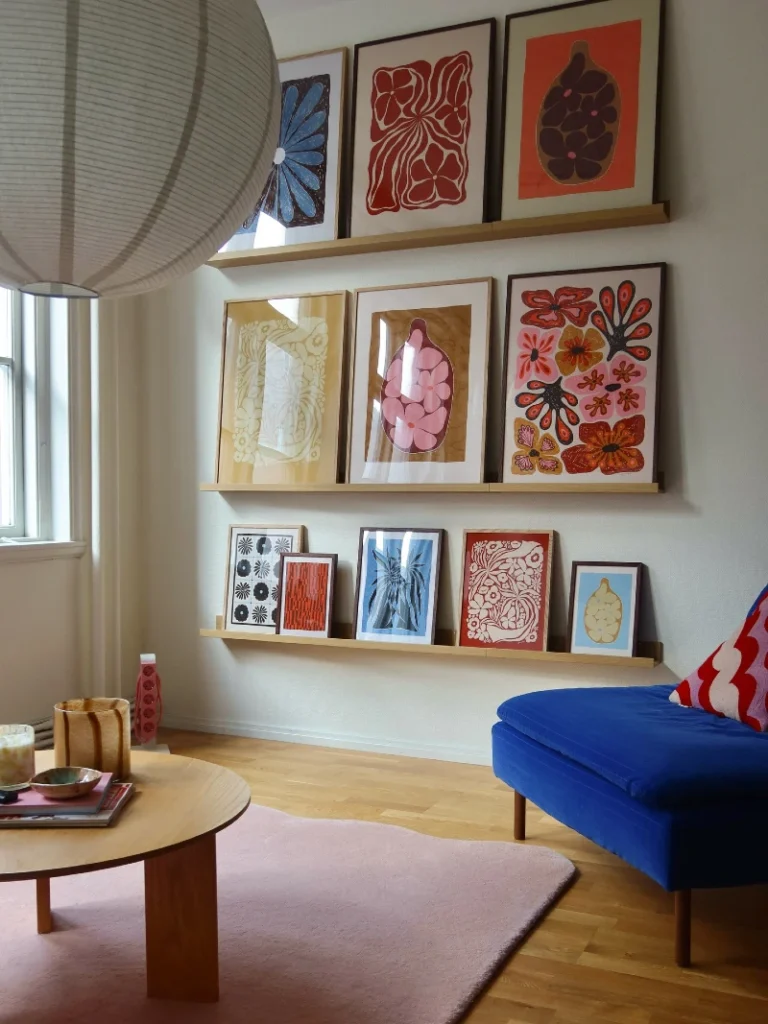
A soft beige wall becomes a clean display zone with three long wooden ledges holding a tightly curated collection of bold prints. The artwork mixes oversized florals, abstract shapes, and graphic botanical forms in saturated reds, blues, and warm neutrals.
Gallery ledges make it easy to refresh your wall without ever touching a drill again.
The layered leaning effect gives the space movement while keeping everything visually aligned. Warm wood tones from the shelves repeat throughout, tying the bold artwork into one calm system.
Why This Works
- Flexibility: Art can be swapped anytime without new holes or damage.
- Color Rhythm: Repeating red and blue tones creates instant visual flow across shelves.
- Depth: Leaning frames instead of hanging adds a relaxed, lived-in gallery feel.
- Balance: Even spacing between ledges keeps the wall structured despite bold prints.
7. Vibrant Maximalist Gallery Wall Above Mustard Velvet Sofa with Eclectic Color Layers
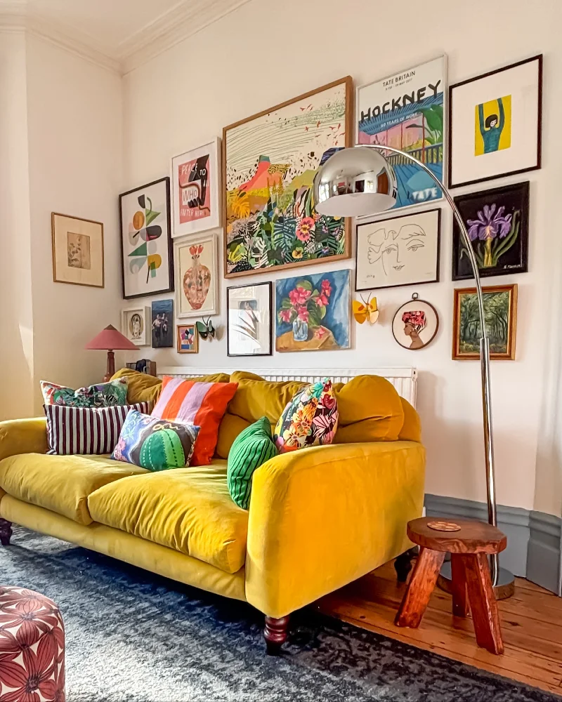
A bold mustard-yellow sofa sits against a cream wall filled edge-to-edge with a dense, colorful gallery arrangement. Frames of all sizes overlap visually through tight spacing, showcasing florals, abstract sketches, portraits, and graphic prints in saturated reds, greens, and blues.
A maximalist gallery wall works when color repetition quietly controls visual chaos.
Despite the variety of artwork, the palette stays anchored through warm yellows, reds, and natural greens. The tight grid structure keeps everything readable, even with heavy visual detail.
Why This Works
- Color Anchor: Repeating warm tones in sofa and artwork prevents the wall from feeling scattered.
- Layering: Dense frame placement creates a lived-in, curated-over-time effect.
- Focal Point: The largest central artwork holds visual weight and stabilizes the composition.
- Lighting: Reflective metal and soft lamp light add depth and movement across the wall.
8. Playful Graphic Gallery Wall with Yellow Line Art Above Cream Sofa and Bold Cushions
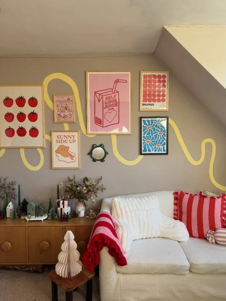
Below, a cream sofa with red striped cushions adds strong contrast and energy to the scene. A soft beige wall becomes a lively canvas filled with framed graphic prints in warm reds, blues, and earthy tones.
A single continuous line element can unify even the most playful and mixed gallery wall.
The frames vary in size but stay visually connected through shared color warmth and consistent spacing. Decorative objects on the console add small moments of detail that support the wall without competing with it.
Why This Works
- Visual Connector: The yellow line ties separate frames into one flowing composition.
- Color Rhythm: Repeating reds and warm neutrals keeps the bold prints visually grounded.
- Playful Balance: Mix of typography and illustration adds personality without clutter.
9. Bold Modern Gallery Wall Above Low Bed with High-Contrast Black Frames and Graphic Art Mix
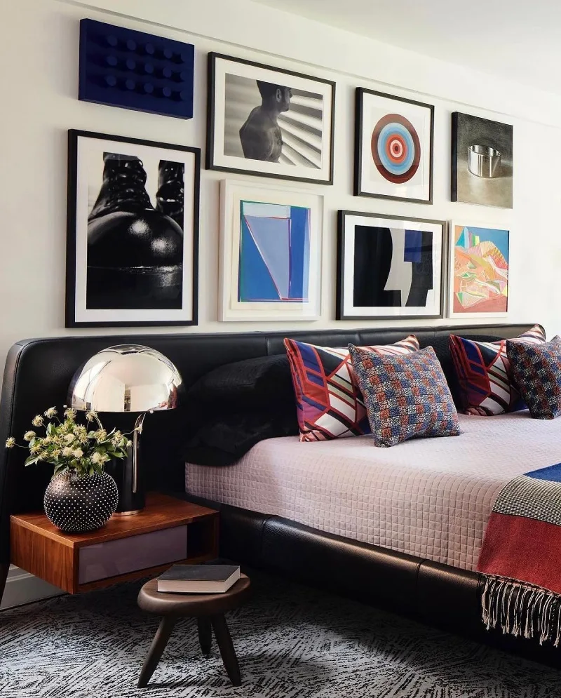
Deep blues and reds in the pillows echo the artwork and add controlled energy to the otherwise minimal palette. A metallic table lamp beside the bed reflects light softly across the composition. A crisp white wall becomes a strong visual grid of framed artwork in black and white borders, arranged above a low black bed.
High contrast frames work best when repetition in color and spacing keeps the wall visually disciplined.
The layout stays clean even with bold artwork because each frame has enough breathing space. The mix of monochrome photography and saturated graphics creates tension that feels intentional rather than busy.
Why This Works
- Contrast Balance: Black frames against a white wall sharpen every piece without overwhelming the room.
- Color Echo: Pillow patterns repeat artwork tones, tying furniture into the gallery.
- Structured Spacing: Equal gaps keep the arrangement readable despite varied styles.
- Material Mix: Soft textiles against hard frames prevent the wall from feeling too rigid.
10. Dining Room Gallery Wall with Mixed Photography Above Wooden Table and Sculptural Lighting
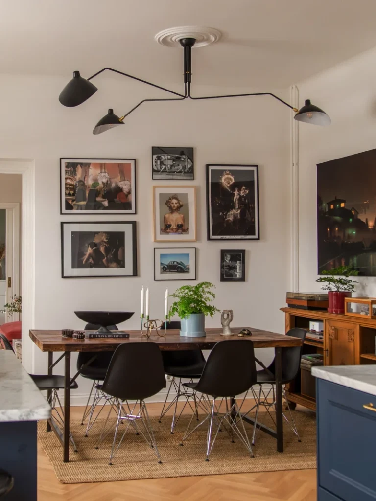
A white dining wall becomes a structured gallery of framed photography and art prints arranged in a loose grid above a long wooden table. The frames mix black and white images with warmer portrait tones, creating contrast without breaking visual rhythm.
A dining gallery wall works best when lighting and artwork share the same visual direction.
The arrangement feels balanced because darker frames repeat across the wall in measured intervals. Even with different subjects, the consistent spacing keeps the whole composition calm and readable.
Quick Styling Tips
- Budget version: Mix printed photography with personal prints to build a full wall without expensive art.
- Renter tip: Use removable strips to align frames in a grid without drilling holes.
- Pro move: Match your light fixture shape to the structure of your gallery for a stronger visual link.
11. Warm Eclectic Living Room Gallery Wall with Mixed Frames Above Neutral Sofa and Burgundy Coffee Table
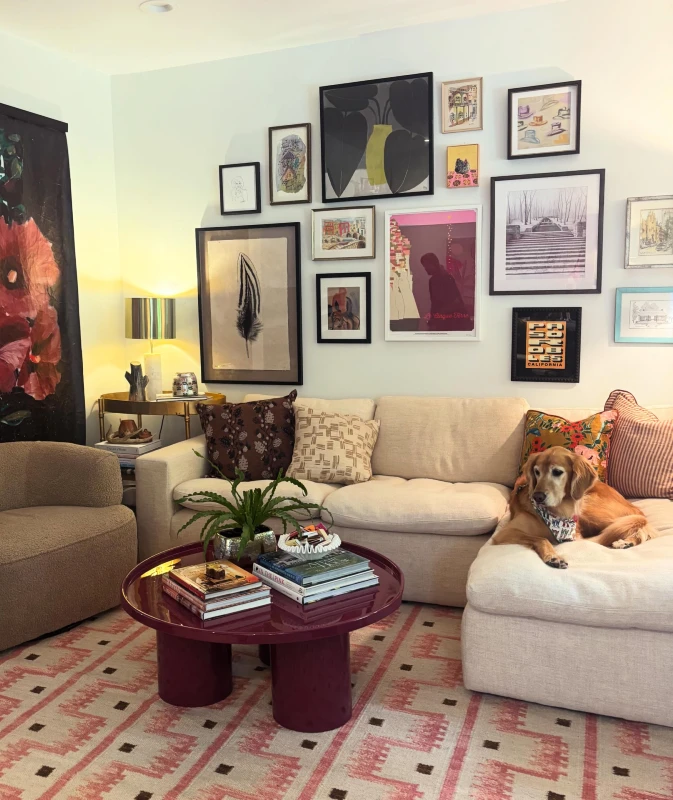
Warm light from a side lamp softens the wall while a dog rests calmly on the sofa, adding life to the space. A soft beige sofa anchors a cozy corner beneath a tightly arranged gallery wall filled with varied artwork styles.
The frames include portraits, abstract prints, line drawings, and muted landscapes, all balanced in a controlled but relaxed layout.
Mixing frame styles works when the spacing stays consistent and the color story quietly repeats.
The gallery feels collected over time, yet the alignment keeps it visually steady. Earthy tones in furniture and art help even bold pieces sit comfortably together.
- Focal Point: Larger central artwork anchors the arrangement and guides the eye naturally.
- Color Anchor: Repeated warm neutrals and muted reds connect art with furniture pieces.
- Layering: Different frame sizes add movement without breaking the structure.
- Texture: Soft upholstery, wood, and textiles balance the sharp lines of framed art.
12. White Brick Gallery Wall with Gilded Frames and Color-Rich Art Above Neutral Sofa
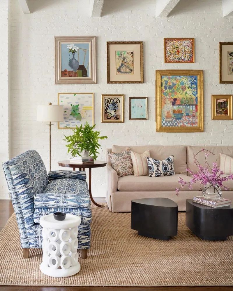
A textured white brick wall becomes a bright gallery backdrop filled with gold, wood, and black frames arranged in a loose, balanced cluster. The artwork mixes still life paintings, abstract florals, and playful illustrations, each bringing a different mood but staying connected through warm tones.
A white textured wall lets even highly colorful artwork feel grounded and breathable.
The mix of frame finishes keeps the gallery from feeling flat, while the spacing allows each piece to stand alone. Natural light bouncing off the brick surface softens the entire composition.
Why This Works
- Texture Base: White brick adds depth so bold artwork doesn’t overwhelm the space.
- Frame Variation: Mixing gold, black, and wood frames creates subtle visual rhythm.
- Color Balance: Repeated warm tones in cushions echo the art for cohesion.
- Asymmetry: Slightly uneven placement makes the wall feel collected over time.
13. Bold Central Abstract Gallery Wall with Color Blocks Above White Sectional Sofa
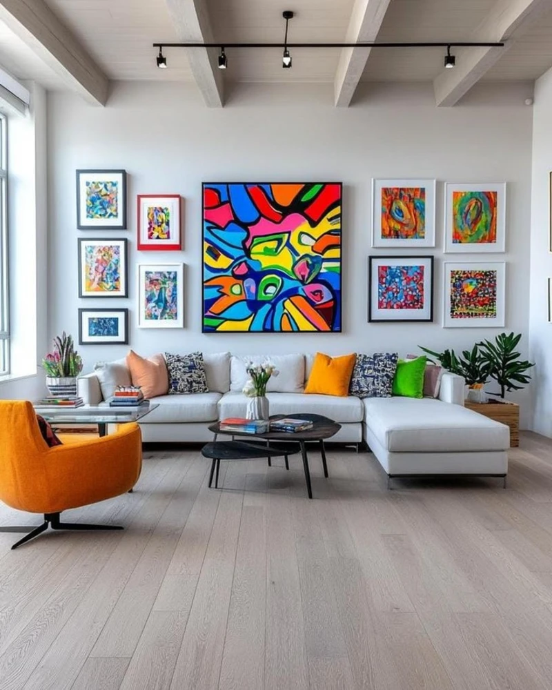
A crisp white wall becomes a striking gallery dominated by a large central abstract painting filled with bold, flowing color shapes in red, blue, yellow, and green. Smaller framed artworks flank it on both sides in a loose but balanced arrangement, each one carrying its own burst of color and texture.
A strong central artwork can hold a full gallery wall together even when every surrounding piece feels different.
The composition feels energetic but controlled because the largest piece sets a clear visual hierarchy. Repeating bright tones in the furniture echoes the artwork, turning the entire wall into one connected color story.
14. Linear Floating Shelf Gallery Wall with Layered Art Above Soft Neutral Sofa
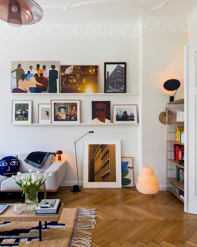
A soft white wall becomes a structured but relaxed gallery built across two long floating shelves. Framed artworks in varied sizes lean casually against the wall, mixing portraits, urban photography, and expressive paintings in warm and moody tones.
Floating shelves turn a gallery wall into something flexible, layered, and easy to evolve over time.
The leaning frames create a soft, lived-in effect instead of rigid alignment. Even with mixed styles, the horizontal shelf lines keep everything visually organized and calm.
Why This Works
- Layering: Leaning frames create depth without permanent wall damage.
- Structure: Shelves replace strict alignment with natural horizontal order.
- Flexibility: Art can be swapped easily without re-hanging anything.
- Warm Balance: Soft lighting and wood flooring prevent the display from feeling too stark.
15. Staircase Salon Gallery Wall with Layered Boho Frames and Warm Eclectic Living Room Corner
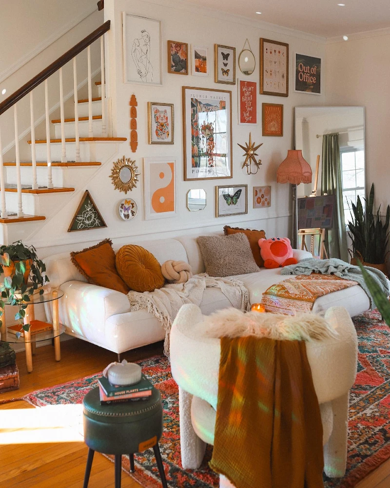
A white wall along the staircase becomes a dense gallery filled with mixed frames, mirrors, and playful wall objects. The arrangement moves upward with the stairs, mixing botanical sketches, bold typography, sunburst decor, and soft abstract prints in warm oranges and earthy tones.
A staircase wall becomes a design moment when the artwork follows the natural movement of the space.
The composition feels lively because every frame has its own personality, yet the spacing stays consistent enough to keep balance. Small decorative pieces like mirrors and sculptural accents break the flat rhythm of frames.
Quick Styling Tips
• Budget version: Mix printed downloads with thrifted frames to build a full wall over time
• Renter tip: Use strong removable strips and lightweight frames to avoid wall damage
• Pro move: Extend the gallery upward following the staircase angle for a natural flow
16. Burgundy Accent Wall Gallery with Layered Vintage Animal Prints Above Rust Sofa
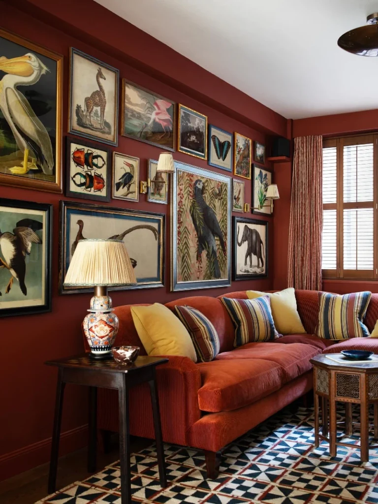
A deep burgundy wall becomes a dramatic backdrop for a tightly curated gallery of vintage-style animal illustrations and botanical prints. Frames in black, gold, and wood are arranged in a structured but slightly varied grid, giving the wall a museum-like feel.
Dark accent walls make gallery collections feel more intentional and visually grounded.
The mix of ornate frames and detailed illustrations creates a layered, collected-over-time atmosphere. Wall sconces and table lighting soften the depth of the burgundy, preventing the gallery from feeling too heavy.
Why This Works
- Color Depth: Burgundy wall enhances contrast and makes lighter artwork stand out.
- Thematic Unity: Animal and botanical subjects create a cohesive vintage narrative.
- Frame Mixing: Gold and black frames add richness without visual conflict.
- Warm Layering: Repeated warm tones in sofa and decor connect wall and seating area.
17. Gold Framed Coastal Gallery Wall Above Navy Sofa with Balanced Symmetry
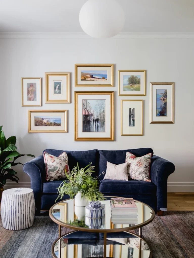
A soft grey wall becomes a calm gallery arranged in a clean, symmetrical grid of gold-framed artwork. The collection includes coastal landscapes, figurative studies, and soft impressionist scenes, all kept visually unified through warm tones and cream matting.
Gold frames instantly lift even simple artwork and give a gallery wall a quiet, cohesive rhythm.
The spacing between frames stays consistent, which keeps the arrangement feeling intentional rather than crowded. Even with different subjects, the shared framing style and warm tones hold everything together as one visual story.
- Frame Consistency: Matching gold tones unify varied art styles into a single composition.
- Color Anchor: Navy sofa and soft florals balance the warmth of the frames.
- Spacing: Equal gaps between frames create calm structure across the wall.
- Focal Flow: The central larger piece naturally draws the eye and organizes the layout.
18. Eclectic Compact Gallery Wall with Floating Shelf and Warm Neutral Sofa Corner
A soft beige tufted sofa sits beneath a compact gallery wall arranged in a loose cluster of small framed artworks. The pieces mix sketch-style portraits, abstract shapes, and bold red and earthy tones, creating a collected studio feel.
Small gallery walls feel more personal when frames vary in size but stay tight in visual grouping.
The arrangement works because it balances art with everyday objects, making the wall feel lived in rather than staged. Warm neutrals in the sofa and wood flooring keep the bold art from overpowering the room.
Why This Works
- Cluster Layout: Tight grouping of frames creates impact even with smaller artwork.
- Color Echo: Red accents in art and shelf create a subtle repeating rhythm.
- Functional Styling: Mixing decor with utility pieces keeps the space realistic and grounded.
19. Minimal Renter-Friendly Family Gallery Wall Above Neutral Sofa with Soft Light Frames
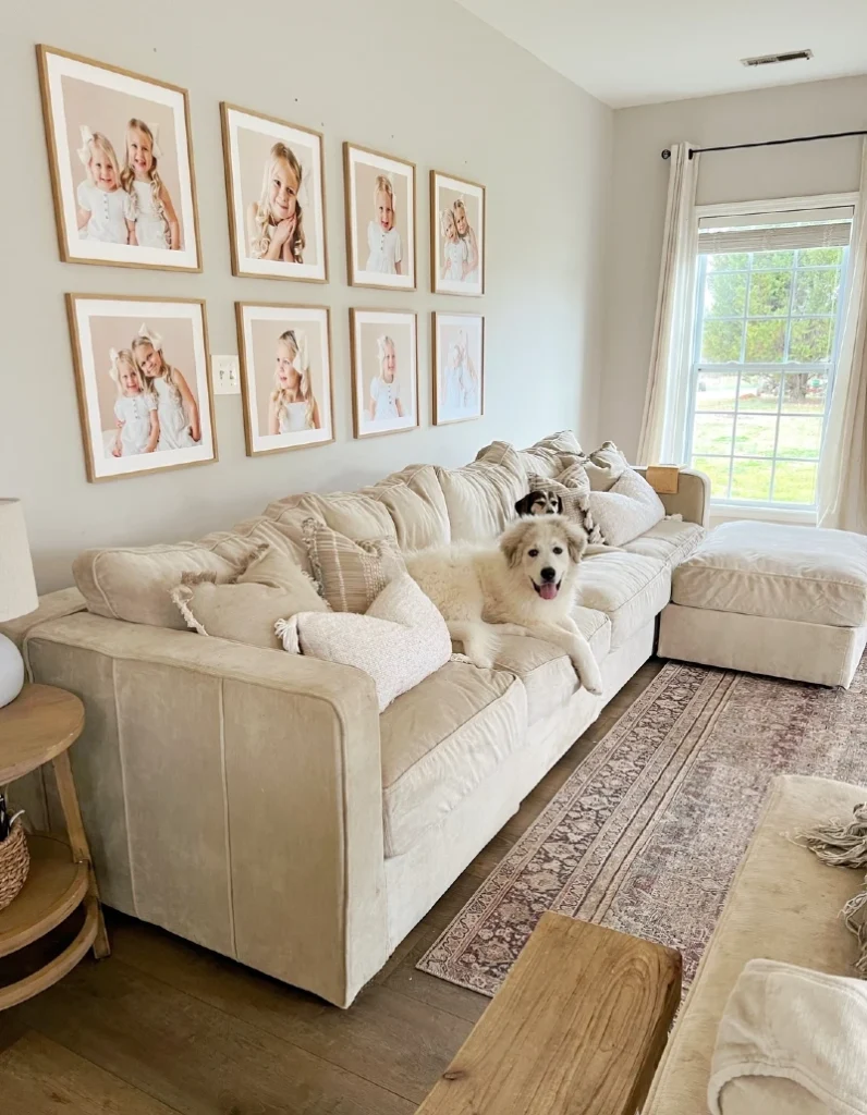
Natural daylight from the window softens the entire space and enhances the warm, lived-in feel of the room, where two dogs rest comfortably on the sofa.
A calm beige sofa sits beneath a clean, evenly spaced gallery wall of family portrait frames. Each photo is matched in similar wooden frames and soft white mats, creating a uniform rhythm across the wall.
Matching frames and consistent spacing are what make a family gallery wall feel calm instead of cluttered.
The repetition of similar tones keeps the visual noise low, even with multiple images. This approach works especially well in rental spaces where you want warmth without overwhelming the wall.
Why This Works
- Frame Consistency: Identical wooden frames unify multiple personal photos into one clean display.
- Grid Structure: Even spacing keeps the arrangement orderly and easy on the eye.
- Soft Neutral Palette: Beige furniture and white mats prevent visual overload.
- Personal Focus: Simple styling ensures the emotional value of the photos stays front and center.