
You buy beautiful furniture and paint samples, but your room still looks totally chaotic or completely boring. This mismatched look leaves you feeling stressed out in your own home, and it feels like a massive waste of your hard-earned money.
The classic 60 30 10 color rule solves this guesswork instantly. It provides a simple math shortcut to balance your space like a professional interior designer.
In this guide, you will get a clear, step by step roadmap to distribute your room colors with absolute confidence.
How the 60 30 10 Rule Fixes Messy Rooms Fast

The 60 30 10 color rule is a foolproof interior design formula. It divides a room color story into three distinct, manageable layers. This rule creates a perfect room color balance every single time.
Why does this rule work so well? It comes down to human psychology and visual weight. The human brain naturally craves proportion and breathing room.
If a room has too many bright colors everywhere, your eyes get tired. The largest part of the ratio provides a visual resting place. This prevents cognitive overload so you can actually relax in your space.
To visualize this, think of the surfaces that dominate your field of view. Professional designers break down the percentages using clear categories:
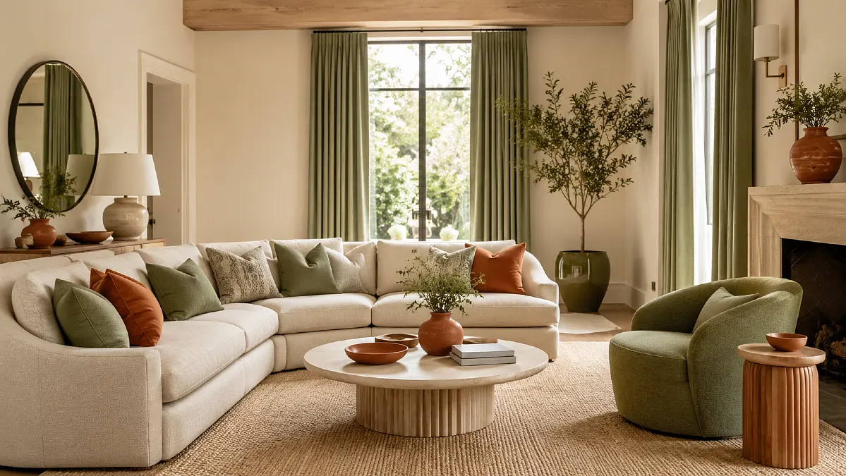
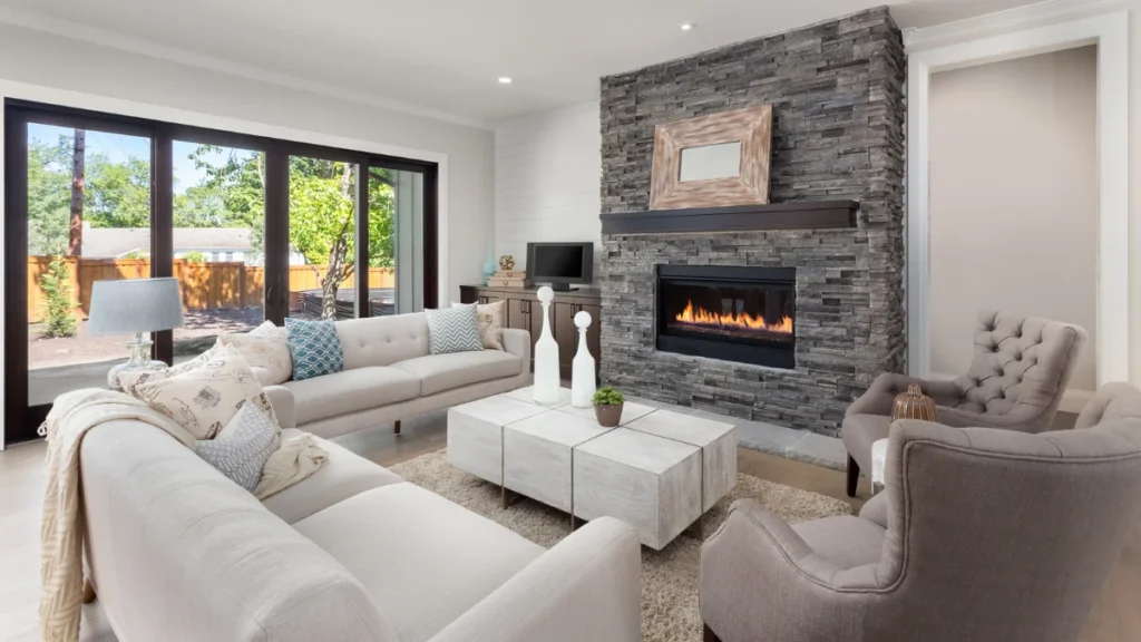
- 60 percent is your main color. This forms the dominant base of the room. It covers large structural items like your walls, major floor areas or large rugs, and your main foundational sofas.
- 30 percent is your secondary color. This supports the main color. It includes mid sized items like accent chairs, curtains, painted cabinets, or large cushions.
- 10 percent is your accent color. These are small, impactful pops of color. Think of artwork, throw blankets, small decorative accessories, and books.
Molly Freshwater, the co founder of Secret Linen Store, shares a great tip for this canvas. She emphasizes starting with the most subtle shade as your 60 percent base. Doing this makes refreshing your accent trends effortless later on.
You can change the small items without repainting the entire room. By assigning these proportions, you give the human eye a clear hierarchy to follow, preventing visual exhaustion.
3 Steps to Beautifully Distribute Colors in Any Space

Implementing this rule is highly intuitive once you tackle the space from the largest surfaces down to the smallest details. You do not need a design degree to get this right.
Just follow these three chronological steps.
The 60-30-10 Palette Rule
Mathematical composition of interior scale
The Dominant Envelope
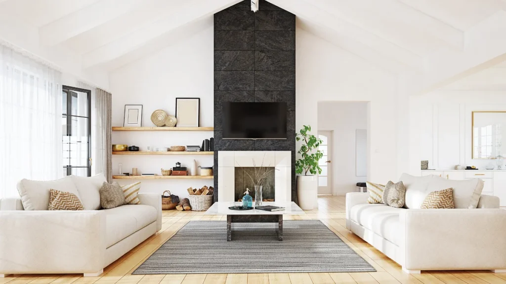
Establish your base canvas by applying your 60 percent dominant color. Choose soft neutrals, warm off whites, or muted tones to reflect light and keep the room open.
The Structural Supporting Actor
Anchor with secondary furniture once your foundation is set. Layer in your 30 percent secondary shade using natural wood tones, deep painted built ins, or saturated fabrics.
The High-Energy Accent
Inject accent details as the final touch. Strategically deploy your 10 percent accent color in high energy, vibrant pops to pull attention to focal points like a fireplace.
Because your accent color only claims 10 percent of the landscape, it is the perfect place to take a creative risk without overwhelming the room.
If you get tired of your accent shade next year, you only have to replace a few inexpensive pillows and accessories.
You save money and time when you design with this clear structure. You no longer have to guess if a store item will match. You just ask yourself which bucket the item fits into.
How to Choose Your 3 Color Palette Without Clashing
Knowing the ratios is one thing, but how do you actually choose three colors that do not clash? You can use the color wheel to build your interior design color palettes.
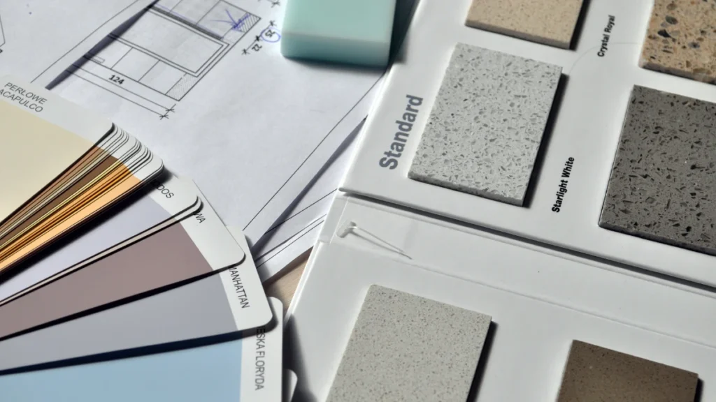
Before you buy any paint samples, test your ideas using digital color palettes. Free online tools like Coolors or Adobe Color let you lock in your shades and see them side by side. Once you choose a palette online, use a smart sample strategy.
Paint a few removable sample boards instead of painting directly onto your walls. Move these boards around the room to observe how light affects the color throughout the day.
To help you choose, look at how the three main color wheel strategies compare:
| Scheme Type | Visual Vibe | Best Room Choice |
| Monochromatic | Extremely calm and quiet | Bedrooms and home offices |
| Complementary | High energy and bold | Living rooms and playrooms |
| Analogous | Peaceful and nature inspired | Dining rooms and entryways |
How to Apply the Formula in 3 Common Rooms
Different rooms serve different purposes in your home. Because of this, your color distribution needs to adjust to the specific function of the space.
For example, a living room needs to feel welcoming for guests. A bedroom needs to promote deep sleep and rest. A kitchen needs to feel clean, bright, and highly energized.
You can use the exact same 60 30 10 proportions in each space while completely changing the actual colors to fit the mood.
Here is a quick look at how to map out your colors across three common spaces:
| Room Type | 60 Percent Base | 30 Percent Secondary | 10 Percent Accent |
| Living Room | Soft gray walls and sofa | Navy blue chairs and drapes | Burnt orange pillows and art |
| Primary Bedroom | Muted sage green walls | Natural oak wood furniture | Soft white linens and rugs |
| Modern Kitchen | Crisp white cabinets | Dark charcoal kitchen island | Brushed brass metal hardware |
How to Break the Rules for a More Natural Look
Once you feel comfortable with basic color proportions, you do not have to follow the math like a rigid calculator. Design formulas are helpful guides, but the best homes feel lived in and personal. You can tweak the numbers slightly to match your unique style.
Rebecca Hughes, the founder of Rebecca Hughes Interiors, notes that while the rule is an excellent starting point, the most sophisticated spaces focus on tonal balance. They respond to light and mood rather than rigid math formulas.
Bari Jerauld, the founder of Blank Slate Studio, also advocates for timeless, grounded palettes. She believes your colors should sit quietly alongside natural materials rather than blindly executing rigid distribution rules.
If you want to step past the basic ratio, look at these three advanced adjustment strategies:
| Strategy Name | Main Adjustment | Main Benefit |
| The Four Color Split | Divide the ten percent accent into two distinct shades | Adds extra visual texture |
| Tonal Layering | Use different depths of the same base color family | Looks soft and less rigid |
| The Dark Base Swap | Make the sixty percent base dark instead of light | Creates a cozy, moody environment |
Ultimately, the numbers serve as your compass, but the true goal is a space that feels personal, balanced, and intentional.